Showing posts with label Original Prints. Show all posts

Thursday, November 20, 2014

What is a Proof? Artists Proofs and Printer's Proofs


Art collectors often ask our gallery about this topic, so today we are going to shed some light on the differences between different proofs and the printed edition.


What is a Limited Edition?
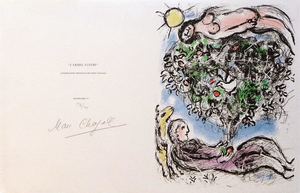
 
http://denisbloch.com/object.php/1285/marc-chagall-arbre-fleuri-lithograph-mourlot-915-louvre-catalogue
Marc Chagall "L'Arbre Fleuri I" - Lithograph - Edition of 100

When an artist prints a limited edition original print, such as a: lithograph, etching, aquatint, carborundum, screenprint, linocut, or woodcut, a set number of identical prints are made. This set number is the "Edition Size," and these will generally be numbered sequentially and hand-signed by the artist. An edition size can vary from extremely small editions of 5 to large editions of 1,000 or more. Open editions have an unknown or unlimited quantity of prints.


http://denisbloch.com/object.php/1104/joan-miro-la-magie-quotidienne-dupin-271-etchings-for-sale
Joan Miro "La Magie Quotidienne" - Etching - Edition of XV on Japon

Sometimes there are different editions printed on different kinds of paper. As an example there may be a regular edition on Arches paper with a limit of 100. These 100 prints are signed and numbered sequentially from 1/100 to 100/100.  In addition to this edition on Arches paper, a smaller edition of 15 are printed on Japon paper and numbered sequentially in roman numerals from I/XV to XV/XV and signed by the artist. This brings our total edition, to 115 prints + any additional proofs that may exist.

So What is a Proof?


A proof is usually an identical print to the regular edition, that is printed at the same time - but is not part of the numbered sequence. This is known as a "Proof Aside from the Edition," and these may or may not be hand-signed by the artist. In general with any edition printed there can be anywhere from 5-50 extra proofs aside from the edition.

Pablo Picasso "Farol (B. 945)" - Linocut - Epreuve d'artiste

Often these extra proofs are retained for the artist, otherwise known as an "Artist Proof". An artist proof can be annotated "A.P." for Artist Proof, or "E.A." in French "Epreuve d'artiste". Sometimes artists can additionally dedicate and gift a proof to a friend, collaborator, dealer, printer, or even family member.


Zao Wou-ki "En Attendant un Jour de Fete (250b)" - Etching - BAT with notes
A "Printer's Proof" designated as "P.P." is much the same, an extra proof made aside of the numbered edition retained by the printer or atelier. The "P.P." can also sometimes stand for "Publisher's Proof". The printer's proof is usually for approval by the master printer to ensure the quality of the printing, and can sometimes include notes and annotations about the printing process. The "BAT" or "Bon à Tirer" is a kind of printer's proof, normally use as a control example against which the other impressions are compared. Bon à Tirer is French for "Good to Print" and is also kept by the Printer or Atelier studio.


Sam Francis "Untitled I (TP)" - Etching - Color Trial Proof

 
Another kind of proof is the "Trial Proof" annotated "T.P." The trial proof is essentially a test proof, often to test colors or the final look of the composition. It is sometimes also referred to as a "working proof" by which the final composition of an edition has not yet been realized. Trial proofs are often thought of as unique prints as they are a one-of-a-kind version of the composition. Art historians, curators, and collectors view working proofs as especially desirable because of their rarity, and the insight they may give into the progress of the work.

http://denisbloch.com/object.php/556/marc-chagall-le-peintre-devant-le-village-mourlot-604
Marc Chagall "Le Peintre devant le Village II" - Lithograph - HC aside from edition

The last form of a "Proof" is the "H.C." which stands for the French term "Hors Commerce" or "Not for Sale". These are exactly as they sound, identical proofs to the regular edition that are not intended to be sold. Prints designated H.C. are often given to the project collaborators as a form of appreciation or partial payment.

Total Tirage

Marc Chagall Catalogue Raisonne Description

"Tirage", the French term meaning "output," is the total number of prints printed for an edition, including any proofs, APs, PPs, HC, and TPs. It is important to note that not every limited edition includes all of these, and the complete number of prints within a tirage are usually described in the artist's Catalogue Raisonné. Some artists and editions are catalogued very well and include full descriptions of the tirage, while others may have basic information only about the numbered edition.


For more information about printmaking and collecting original prints please visit our website:


Saturday, September 27, 2014

Rauschenberg - Signs of the Times

Robert Rauschenberg - Signs - 1970 - Screenprint Signed

Robert Rauschenberg’s“Signs” 1970, is one of the most sought after Rauschenberg screenprints because of the artwork’s incredible iconographic imagery and historical significance. "Signs" was originally commissioned by Time Magazine, with the intention that it would be used as the January edition cover for the year 1970. After considering the final composition, the executives at Time Magazine found the piece was more politically charged than they had hoped and decided against using it. It was felt that the composition, though stunning, was more of a recapitulation of the 1960’s than a welcome to the new decade.

After the dismissal by Time Magazine, Robert Rauschenberg’s trusted dealer Leo Castelli convinced him to print a limited edition screenprint of “Signs”. The edition was published by Leo Castelli in New York in an edition of 250; each signed, dated ‘70’, and numbered in pencil.

“Signs” is an astounding collage encompassing the monumental events and people of 1960’s America. Rauschenberg masterfully juxtaposes scenes of innovation like the moon landing with the destructive violence of the war in Vietnam and the civil rights movement. The revolutionary nature of the era is pronounced through the images of peace protestors at the top, whose rallies for change and peace are echoed by the voice of Janis Joplin deeply singing into her microphone. The iconic leaders of the era including JFK and his brother Bobbie Kennedy challenge the divisive violence of the wars and civil unrest, even as their forms and images transition into the faces of martyrs. The “Signs” of this transformative decade are woven seamlessly by Rauschenberg, and the screen print is known as one of his most important works of art.

National Gallery of Australia


DENIS BLOCH FINE ART is please to offer a number of original
signed prints by Robert Rauschenberg.

Click Here To View The Collection!

Friday, June 20, 2014

Art Terms Decoded: What does "Stoned Signed" or "Plate Signed" Mean?

Andy Warhol "Marilyn Monroe Castelli Invitation" signed in felt pen.
 
As you begin to delve deeper into the world of fine art collecting you will find that one of the most important indicators of value and potential worth is the artist's signature. Some might even say that this is the most important aspect of an artwork that makes it a desirable luxury commodity.

The reasoning behind the incredible value of the artist's signature above all else, is that a signature is the easiest way to determine the authenticity of a work of art. Many have tried to fake the signature of the great master artists throughout time and sometimes people are fooled - but often expert art dealers, gallerists, curators and appraisers are able to catch a fraudulent mark. A fake signature automatically calls in question the authenticity of the work itself whether it is a painting or original
print.
 

Picasso "Le Vieux Roi" hand-signed in Blue
Picasso "Le Vieux Roi" Plate Signed in Red

From a pure collectorship stand point a hand-signed artwork is going to be the most valuable investment. That is not to say that an unsigned artwork does not have value, it just means the MOST valuable artworks are hand-signed ones.
 
Picasso "Ronde de la Jeunesse" Signed in the Stone
So this brings us to our term "Plate Signed" sometimes also known as "Stone Signed". A plate signed work is specifically referring to an original print or graphic on paper with a printed signature. This is precisely what it sounds like; a plate signature is a signature that is part of the composition and is printed along with the art image. As an example scenario: Pablo Picasso draws an etching composition onto a metal plate - he then signs the plate and dates it - the plate is inked and pressed onto paper and along with his etching Picasso's signature is printed. This would be a "plate signed" original etching.
 
The term "stone signed" is exactly the same but specifically references the stone slabs that might have been used to create an original lithograph. Sometimes artist catalogue raisonnes reference that an edition is "sign in the stone," which is also the same. 
 
The most important take-away in terms of collecting a plate or stoned signed artwork is that it is not equivalent to a hand-signed work and should be valued as such.
 
You can see more of our hand-signed, plate signed, and stoned signed original prints on our website:

Saturday, June 14, 2014

Art Terms Decoded - What does "Acid Free" Mean?

Pablo Picasso Linocut - Perfect Margin Conditions

Have you ever bought an original art print and encountered the term "Acid Free"?  Probably your art dealer or framer mentioned it? Well here is a useful definition of this important art term to give you some insight into protecting and preserving your fine art print investments:

Example of Acid Burn from non-archival framing


The term "Acid Free" refers to the materials used to frame an original artwork. When you frame a work of art - particularly a work on paper you must be extremely careful about the framing materials. Cardboard or regular tape have acidic properties that will eventually over time "burn" the paper or canvas that is exposed to them. The exposure to acidic matting, paper, or even storage materials causes a brown discoloration and deterioration of the paper. Many times the discoloration may occur underneath a frame and cannot be seen.
Pablo Picasso Etching with acid mat burn

When an artwork has been exposed to acidic materials and discolored it seriously devalues the piece. As mentioned in previous posts the investment quality of an artwork is heavily determined by the excellent condition of the piece. That is not to say that a damaged piece has no value, sometimes prints can be restored by a professional paper conservator depending on the level of damage, however this can be an expensive process.

To safely protect your fine art prints and artworks specify to your framer that you want only Acid Free or Archival matting, backboard, and hinging. We additionally recommend UV protective plexi-glas to further preserve your artwork.


For More Information on Art Conservation and Professional Art Terms visit our website: www.denisbloch.com/art_terms.php
 
We also welcome comments and questions regarding archival acid free preservation!
 
info@denisbloch.com / 310-270-4880
 

Saturday, October 26, 2013

IS ART A GOOD INVESTMENT?


There are a number of indicators that prove that Fine Art, carefully selected, can be a lucrative commodity investment. Art is one of the most enticing hard asset investments, as collectors have created a hefty supply and demand system throughout the years.

According to Michael Moses, a retired New York University business school professor who co-
Marc Chagall
created the Mei Moses World All Art Index, over the past 60 years, the total return on fine art has been very similar to the return on the S&P 500-stock index. "If you use the last 30 years, the S&P substantially outperforms art," Moses says. "If you look at the most recent eight [to] 10 years, art has outperformed the S&P."


Another reason to consider investing in Art is that Fine Art has a proven track record as a good choice during hard times. Fine Art is more or less resilient to times of economic turmoil and trouble. It has outperformed during all of the wars of the 20th century, and has outperformed during the last 27 recessions. One of the biggest draws to this asset class is the fact that there is no underlying financial market to tinker with prices. There will never be a bad trade or a flash crash that will suddenly erase the value of your art investment. Though it is not a guarantee, Art also has the potential to appreciate with time.


The last and perhaps most rewarding aspect of collecting Fine Art are the emotional and aesthetic rewards. Because Art is a physical asset class, your investment is something that you can potentially enjoy every day.


COLLECTING THE RIGHT ARTIST

The greatest draw back to investing in fine art is the relative unpredictability of the performance an artist’s body of work might have. Like other markets there are artists and artworks that are highly unlikely to retain or develop future value, and so it is very important as a beginning collector to be highly selective of the artists you collect. The best advice is that you select artists with established markets. A blue-chip artist would have a major following, specifically by academic and museum interest. The Artist is your best indicator for potential value.

Pablo Picasso
Normally a museum artist like Picasso, Warhol, or Hockney would be out of range for the average
collector, but through the limited edition prints market you can attain these artists for a few thousand dollars as opposed to a few million. Many collectors and art dealers will tell you that originals will always perform better than prints, and this is half true. The original paintings for Pablo Picasso or Damien Hirst will always outperform the graphic artworks for these artists certainly, and if you have the capital to invest in high-level paintings of Museum Masters, I strongly recommend that this is the market you seek. However, an original painting by an immerging and unknown artist vs. an establish master’s print will not necessarily hold value or outperform the print. The performance of an original painting depends heavily on the current market and demand for the artist.


COLLECTING THE RIGHT PIECE

Aside from the Artist, other excellent indicators of future potential rest on the work itself. It is true that some compositions are simply more aesthetic than others. Some artworks may bear iconic images and characteristics of an artist’s specific period or style. It can be beneficial to research an artist’s backstory, as it can have a fair amount of weight in the resale value of a piece. Additionally if you are collecting sculptures or original prints the edition sizes can also play a major factor. When deciding what art to buy, the most important is that you enjoy and appreciate the art.


Tuesday, December 27, 2011

Sam Francis – Space and Color

Sam Francis - Trietto II - Aquatint Print
“Painting is about the beauty of space and the power of containment.” – Sam Francis

Sam Francis with Wallse Ting in studio
American Abstract Artist Sam Francis was late to start his successful and brilliant career as a painter and printmaker. While serving as a pilot in the United States Air Force during WWII, Sam Francis suffered an injury that hospitalized him for several years. While recovering, Sam Francis began to paint over the side of his hospital bed to escape the mundane routine of the hospital as well as the pains of his aching body. Developing a love for art and finding an artistic voice was healing for Sam Francis, and the art created in this time had an astonishing remedial effect on Sam Francis’ mental and emotional state.

Sam Francis - Untitled SF345
Lithograph
Sam Francis’ experience as a pilot had a unique bearing on his paintings and prints, which often utilized aerial perspectives to communicate the silence of the skies. Sam Francis’ aerial approach to the canvas became paramount to his methodology as a painter, as well as a signature style for Sam Francis.

During the late 1940s, Sam Francis began producing and exhibiting his earliest abstract artworks. Francis was initially influenced by the work of the Abstract Expressionists, like Mark Rothko and Arshile Gorky, and Sam Francis incorporated many of their techniques and ideas in his art. Despite this influence, Sam Francis’ art was also in close dialogue with modern and contemporary French art. His references ranged from the Water Lilies of Claude Monet, which inspired many of Sam Francis ideas about atmosphere and space, to Pierre Bonnard and Henri Matisse, whose conceptions of pure color were particularly resonant with Francis.

Sam Francis - Pasadena Box (Plate 8)
Lithograph Print
While traveling to Japan during the 1950’s, Sam Francis became interested in Japanese calligraphy and art, particularly the Japanese use of negative space. Sam Francis was acutely aware of the dialogue between color and space on the canvas. In many of Sam Francis’ prints and paintings from the 1960’s the brushwork is relegated to the outer edges, leaving vast empty spaces in the center of each art piece. The negative space, or silence within Sam Francis’ art is as meaningful as Francis’ fluid brushwork of radiant color.

“Color is a kind of holy substance for me,” Francis said. “It’s the element in painting which I am most fascinated with. It is an element of painting which overcomes me. . . . Color in a way is a receptacle for a feeling and a way for you to hold it until understanding arrives or meaning is extracted.” Sam Francis’ artwork further investigated perceptions of light and color by contrasting glowing jewel tones with large areas of white. White in Sam Francis’ art does not function simply as a ground against which he applies color. Rather, the white areas are dynamically engaged in active communication with the colors. For Francis each color had a symbolic value: white corresponded to the infinite, blue to the cosmos and water, and yellow to the sun.

Sam Francis - Untitled - Monotype
Considered one of the premier colorists of the twentieth century, Sam Francis is best known for dramatic, lushly painted works comprised of vivid pools of color, thinly applied. Sam Francis has also been compared to Color Field artists on the basis of large, fluid sections of paint that seem to extend beyond the confines of the pictorial surface. Sam Francis’ art is a dynamic and sophisticated juxtaposition between color and space, a luminous conversation played out in strokes of lush color.

Visit our website for more available prints by Sam Francis.

Tuesday, September 6, 2011

A smARTer Investment

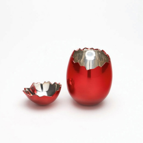
Jeff Koons, Cracked Egg (Red), 2008
If you’d added a few fine artworks to your portfolio over the last few years, instead of all those bank stocks, your retirement nest egg might be looking a little different right now.

Let’s face it, the stock market rollercoaster, particularly in the last month has left the average investor nauseous and contemplating getting off the ride all together (if not already). In many cases the market volatility has driven investors to alternative investment markets like gold and Fine Art.

Fine Art has been an attractive investment for centuries and is becoming increasingly recognized as it has outperformed more conservative investments over the last few decades. It is an alternative investment earning capital gains rather than a dividend.

Indeed, for the last ten years, the price index of all Fine Art works sold more than once worldwide has produced a nearly 11% annualized return, outperforming the Standard & Poor’s 500 index of large cap stocks and most other asset classes, including bonds and commodities.

Marc Chagall, Multiflore, 1974
Fine Art, including paintings, sculpture, original prints and photography is a very interesting long-term asset class. Indeed, investment-grade art enjoys a low correlation with other asset classes, including stocks and bonds, strengthening its case as a candidate for portfolio diversification. And some maintain they can act as an inflation hedge, since “real assets” (like gold) tend to rise in value while the value of money falls.
Since the end of World War II the value of Fine Art works has appreciated enormously. Quality works of art have proved to be a remarkable store of value. This is predominantly due to increasing rarity caused by an expanding demand from museums and collectors, and dwindling supplies.

Before you even think about putting down money, however, it’s important to educate yourself on the forces affecting the art market overall. The best advice is to talk to seasoned collectors and professionals in the industry. Go to the galleries and ask questions. Get involved with the museum and befriend the curator. An educated consumer is going to be best equipped to maneuver in this marketplace.

If, as it is more likely the case, you want to invest your money in something that you also like the look of,
(which I recommend!), make sure that your heart doesn’t rule your head and you buy something that looks pretty but is unlikely to ever accrue in value or worse yet decrease.

On that note, beware of galleries and dealers promoting artists with niche bubble markets. There is a reason we have not seen some very “popular” commercial artists in any major Contemporary Museums – the following of these types of artists is purely promotional, and their value is backed by the people marketing them, not by an actual global market. Over time these types of mega-marketed commercial artists will fall victim to the tastes of the market and will be virtually worthless.

Jim Dine, Fortress of the Heart, 1981-82
It is important to note that the high end of the market is not at the mercy of public taste. The art market has its blue-chip investments (museum artists) and these quality investments will bring a reliable return. Of course, the entry point can be higher. Artwork that emanates from more mature markets, such as Museum Class Master Paintings, can cost anywhere from $10,000 to many millions depending on the artist.


Picasso Linocuts featured at the MOMA 2009
The alternative is the investment in Museum Class Master Graphics or Original Prints with an entry point in the $1,000 level. Of course even great Prints are now expensive, but I’d recommend those! The best ones generally increase in value the most. From a return on investment standpoint, it’s also good advice to buy the best piece you can afford. The market has become much more selective, with an emphasis on quality.

Tuesday, June 21, 2011

Sonia Delaunay Biography: Textiles, Design, and Prints


Sonia Delaunay Original Print -
Composition with Semi-circles

Artist Sonia Delaunay-Terk was born in present day Ukraine on November 14th, 1885 under the surname Stern. At a young age Sonia Delaunay moved to St. Petersburg, where she was cared for by her mother's brother, Henri Terk, a successful and affluent Jewish lawyer. Henri Terk and his wife Anna adopted Sonia Delaunay in 1890 when she assumed the name Sonia Terk. Sonia Delaunay-Terk received a privileged upbringing with the Terks, traveling widely throughout Europe where Sonia Delaunay was introduced to art museums and art galleries.

Sonia Delaunay Etching -
Composition with Circles
When Sonia Delaunay was 18, she was sent to study art at the Academy of Fine Arts in Karlsruhe, Germany. Sonia Delaunay studied in at the Art Academy until 1905 when she decided to join the Modern Art movement at Montparnasse in Paris. Sonia Delaunay was deeply influenced by the post-impressionist art of Van-Gogh, Gauguin, and Henri Rousseau as well as the artists of the Fauves group including Henri Matisse.

During Sonia Delaunay’s first year in Paris Sonia Delaunay met, and married, German homosexual art gallery owner Wilhelm Uhde. It is assumed that Sonia Delaunay’s marriage to Uhde was a marriage of convenience to escape the demands of her parents, who disliked her artistic career. Through Uhde's gallery Sonia Delaunay gained entrance into the Parisian art world and benefitted from his connections, and Uhde masked his homosexuality through his public marriage to Sonia. Through her connections Sonia Delaunay met prominent artists of the modern art movement including: Pablo Picasso, Georges Braque, Georges Rouault, and Maurice de Vlaminck.

Sonia Delaunay met painter Robert Delaunay in early 1909. Sonia and Robert became lovers in April of the same year and it was decided that Sonia Delaunay and Uhde should divorce. The divorce was finalized in August 1910. In November of 1910 Sonia and Robert Delaunay were married. Sonia Delaunay was pregnant with their son Charles who was born on January 18, 1911. Sonia Delaunay made a patchwork quilt for Charles' crib, which is now in the collection of the Musee National d'Art Moderne in Paris. Sonia Delaunay’s quilt was created spontaneously and exemplifies Sonia Delaunay’s use of geometry and color in her textiles, paintings, and original prints.

Sonia Delaunay Aquatint -
Composition with Triangles
Contemporary art critics recognize this as the point where Sonia Delaunay moved away from perspective and naturalism in her art. Robert & Sonia Delaunay became associated with the development of Orphism, a highly abstract art movement which paralleled the geometry of Cubism but with a much brighter color palette. It is said that artist Paul Klee was so taken with Sonia Delaunay’s’ patterning of squares from a 1912 illustrated book, that they became an enduring feature in Klee’s own art.
During the 1910-1920s, Sonia Delaunay focused on bringing this new artistic lyricism into the world of design, transforming Art Deco fabrics into vibrant high fashion clothing, wall coverings, furniture textiles as well as, theatrical costumes. In 1917 Sonia Delaunay met Sergei Diaghilev, and Sonia Delaunay designed costumes for his productions of Cleopatra and Aida.
The Russian Revolution brought an end to the financial support Robert & Sonia Delaunay received from Sonia’s family in Russia, and a different source of income was needed. Sonia Delaunay made clothes for private clients and friends, and in 1923 created fifty fabric designs using geometrical shapes and bold colors, commissioned by a manufacturer from Lyon. Sonia Delaunay’s customers included Nancy Cunard, Gloria Swanson, Lucienne Bogaert and Gabrielle Dorziat.

In the 1930s, Sonia Delaunay returned her focus on painting, joining the Abstraction-Creation group in seeking to create an art based upon non-representational elements, often geometrical, and continuing to focus on color as central to painting. The group was trans-national, and including among its members: Jean Arp, Barbara Hepworth, Wassily Kandinsky and Piet Mondrian. In 1937 Sonia & Robert Delaunay collaborated on a mural for the Exposition Internationale des Arts et Techniques dans la Vie Moderne.

Sonia Delaunay Print -
Geometric Composition
In 1941 Robert Delaunay died of cancer. After Robert death, Sonia Delaunay continued to work and exhibit regularly as a painter & designer, turning often to printmaking including: etchings, lithographs, and pochoirs prints. In 1963 Sonia Delaunay donated 58 of her own works and 40 of Robert Delaunay’s to the Musee National d'Art Moderne, Paris. Sonia Delaunay became the first woman ever to be exhibited at the Louvre during her lifetime when the museum mounted an exhibition of the works in 1964.

In 1966 Sonia Delaunay printed Rythmes-Couleurs with 11 of her gouaches produced as pochoir prints, with texts by Jacques Damase. In 1969 Sonia Delaunay printed Robes poemes, also with texts by Jacques Damase containing 27 Sonia Delaunay prints.

Sonia Delaunay-Terk died in 1979 at the age of 94 with no regrets in her life.

Sonia Delaunay’s work in modern design included the use of geometric abstraction in the integration of furniture, fabrics, wall coverings, clothing, prints, lithographs, and etchings.

Sonia Delaunay was the subject of a recent Exhibition at the Cooper Hewitt National Design Museum.


Select Museum Collections:
Hermitage Museum, St. Petersburg
Museum of Modern Art, New York
Art Institute of Chicago, Chicago
Metropolitan Museum of Art, New York
Hirshhorn Museum & Sculpture Garden, DC
Tate Gallery, London
Reina Sofia National Museum, Madrid
Louvre, Paris

Monday, April 25, 2011

David Hockney Vintage Posters - A Colorful Timeline

David Hockney, Mount Fuji and Flowers,
Offset Lithographic Poster
Artist David Hockney has continued to be an innovative artistic force since the beginning of his career in the 1960s. Although Hockney has always denied being a part of the Pop Art Movement, Hockney is often included under this heading because of the vibrancy of his palette, though he never adopted the iconographic subject matter of the Pop Artists. David Hockney's affiliation with the Pop Artists is mostly by association, and seems more to do with his friendships with peers like Andy Warhol, whom he met in New York in 1961, than Hockney's artwork.

David Hockney, Paper Pool #7, Off-Set Lithographic Poster
Taking a look at the time-line of David Hockney's exhibition, museum, and art posters, we get a good sense of the development Hockney's unique aesthetic and painting style over the years. After completing his training at the Royal College of Arts in London, Hockney's art had adopted a deliberately rough and rudimentary style which Hockney owed a great deal to artists Jean Dubuffet and Francis Bacon. Hockney was in a phase of rapid self-discovery on both artistic and personal levels. David Hockney was coming to terms with his own sexuality while at the same time searching for an artistic style.
  
David Hockney, A Bigger Splash,
Off-Set Lithographic Poster
After his first trip to Los Angeles in 1964, Hockney returned to England set to work on a series of prints and paintings that reflected his American experiences. David Hockney began to incorporate acrylic paint in his art, and Hockney created his first series of stylized Southern Californian landscapes as well as his first swimming pool paintings. One of Hockney's most noted swimming pools is "A Bigger Splash," 1967, which is now a part of the permanent collection of the Tate Gallery, London and the title of a documentary about Hockney that was released in 1974. David Hockney had always fantasized about living in Los Angeles: “Within a week of arriving there in this strange big city, not knowing a soul, I'd passed the driving test, bought a car, driven to Las Vegas and won some money, got myself a studio, started painting, all within a week. And I thought, it's just how I imagined it would be.” In 1978 David Hockney experimented with a process of moulding colored paper pulp, producing a series of twenty-nine Paper Pools. Hockney's "Paper Pools" were greatly influenced by Van Gogh.

David Hockney, Photocollages, Off-set Lithographic Poster

David Hockney, XVI RIP Arles,
Offset Lithographic Poster

During the 1970's David Hockney made his first photomontage or photo collage artworks, which Hockney referred to as "Joiners". David Hockney was greatly inspired by the art of Pablo Picasso particularly Picasso's Cubist Period, and Hockney saw photography and his Polaroid composites as a new investigation of Cubism and pictorial space. David Hockney explored the use of the camera, making composite images of Polaroid photographs arranged in a rectangular grid. Later Hockney used regular 35-millimetre prints to create photo-collages, compiling a 'complete' picture from a series of individually photographed details. In 1985 Hockney lectured on his photographic experimentation at the prestigious Rencontres Internationales de la Photographie in Arles.

David Hockney, Parade,
Off-set Lithographic Poster

During the mid 1970's Hockney embraced the challenge of a new medium, creating a number of designs for various Theatrical productions in London and New York. As a young child, David Hockney had developed an obsession with opera when he first saw the Carl Rosa opera company's production of La Bohème, and Hockney was ecstatic to bring his two passions together. From 1975 - 1993 Hockney produced set and costume designs for:
'The Magic Flute' 1978, 
'Parade' 1981, 
'Oedipus Rex' 1981,
'Tristan und Isolde' 1986,
'Die Frau Ohne Schatten' 1991,
and 'Turandot' 1993.


David Hockney, A Bigger Grand Canyon,
Offset Lithographic Poster

Nichols Canyon
Lithographic Poster

Continuing to be influenced by American culture and the natural landscapes found in California and the Western United States, David Hockney's vivid palette became more striking and beautiful and in 1980 David Hockney painted "Nichols Canyon" after a well known canyon in the Hollywood Hills. In 1982 David Hockney traveled with friends through the American West and Hockney was inspired to create a large photocollage of the Grand Canyon. "A Bigger Grand Canyon" is one of David Hockney's most celebrated artworks, rich with brilliant colors that capture the cascading landscape of the Arizona desert.


David Hockney, Hotel Well III,
Offset Lithographic Poster

During the 1980's David Hockney's palette became imbued with an array of saturated and vibrant colors making Hockney's artwork both dramatic and enticing. During a trip down to Mexico City, David Hockney was moved by the courtyard landscape of his Hotel in Acatlan, Mexico, and enthusiastically created a number of original prints known as the "Moving Focus" series. The "Moving Focus" print series from the mid 1980's is the culmination of Hockney’s experiments with Cubism. The constant shifting focus in Hockney's "Hotel Well III," brings together multiple and simultaneous perspectives, clearly feeding off of Hockney's work with photography and his "Joiner" pieces. Fascinated by the Hotel Well and courtyard, David Hockney revisited the subject in multiple lithographs, incorporating the passage of time and light in the concept of perspective as seen in artworks like "Hotel Acatlan, Second Day" and "Hotel Acatlan, Two Weeks Later."


David Hockney, Hotel Acatlan Second Day, Offset Lithographic Poster

After working with California master printer Ken Tyler in the 1980s making etchings and lithographs, David Hockney explored ways of creating art with color photocopiers in 1986. “The works I did with the copying machine ...were not reproductions,” Hockney said later, “they were very complex prints.” Subject to the same curiosity about new technical methods, David Hockney began to experiment with the fax machine, and in 1989 sent work for the Sao Paulo Biennale to Brazil via fax. David Hockney began experiments using computers, composing images and colors on the screen and having them printed directly from the computer disk without preliminary proofing. David Hockney has had major retrospectives of his art in New York, Los Angeles and London. Technical experimentation has continued to inform and develop the art of David Hockney and his most recent artworks have been created on Hockney's iPad. David Hockney primarily works in his art studio in the Hollywood Hills near Los Angeles, California, where Hockney has lived permanently since 1978.

For more information on David Hockney Art Posters please visit our website:

Saturday, February 19, 2011

RUFINO TAMAYO & MIXOGRAFIA PRINTS


Perro de Luna, 1973 LITHOGRAPH
Rufino Tamayo’s legacy to the history of art is truly found in Tamayo’s oeuvre of graphic prints, in which Tamayo cultivated every technique. A truly innovative print-maker, Rufino Tamayo’s graphic work was produced between 1925 and 1991 and includes the mediums of woodcuts, lithographs, etchings, aquatints, and mixografia prints.


Niña, 1981 MIXOGRAPH
In the early 1970's, printer Luis Remba approached Rufino Tamayo to produce a series of lithographs. Although Tamayo was interested, he made it clear that he was looking for new horizons within the medium - particularly seeking ways to get more volume and texture into his original prints. Together Luis Remba & Rufino Tamayo expanded the technical and aesthetic possibilities of the graphic arts by developing a new genre of multiples, which they named Mixografia.


Dos Hermanos, 1987 MIXOGRAPH
The Mixografia technique is a unique fine art printing process that allows for the production of prints with three-dimensional texture. The quality of a Mixografia print is similar to that of a fresco or bas-relief, in which the surface of the paper has a kind of sculptural depth. The technique not only registered the texture and volume of Rufino Tamayo's design, but it also granted Tamayo the freedom to use any combination of solid materials in its creation. Rufino Tamayo was delighted with the Mixografia process, and Tamayo created some 80 Original Mixographs over his lifetime.

Due to the inability of commercial paper to withstand the stress of the Mixografia three-dimensional printing technique, a more resilient handmade paper was also invented. The paper of a Mixografia print has a heavy and thick consistency that further enhances the sculptural three-dimensionality of a Mixografia print.


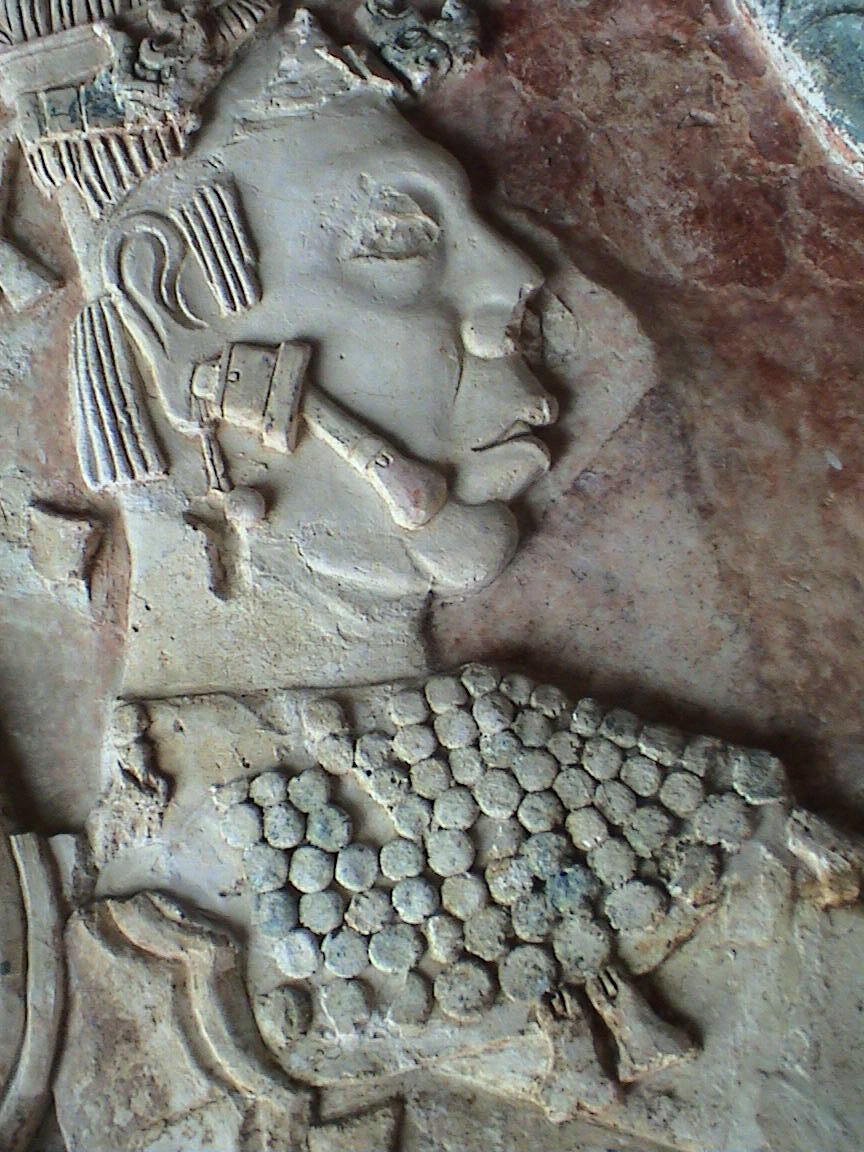
Relief Sculpture from Pelenque Ruins
Greatly influenced by his Mexican and Zapotec heritage, much of Rufino Tamayo’s artwork, particularly Tamayo’s Mixografia prints, illustrate the same weight and feel of Pre-Columbian stone reliefs and sculptures. Rufino Tamayo became interested in Pre-Columbian art as early as 1926, when Tamayo became the head of the department of ethnographic drawing at the National Museum of Archaeology in Mexico City.


Nocturno, 1975 ETCHING
Most of the compositions in Rufino Tamayo’s original graphics are extremely simple yet highly inventive in their technicality. Tamayo was known for taking an elementary drawing and filling it with structural elements, textures and colors obtaining striking etchings, lithographs and mixographs created with eloquent and economical expression.

Hombre, 1979 LITHOGRAPH
Rufino Tamayo was one of the first artists in Latin America to interpret his roots without historicism, anecdote, or proclamation. In doing so, Rufino Tamayo formed one of the most brilliant chapters of the already rich and prestigious field of original graphic art in Mexico.


To view the gallery’s collection of available Rufino Tamayo
Prints please visit our website: