Showing posts with label Art Collecting. Show all posts

Thursday, November 20, 2014

What is a Proof? Artists Proofs and Printer's Proofs


Art collectors often ask our gallery about this topic, so today we are going to shed some light on the differences between different proofs and the printed edition.


What is a Limited Edition?
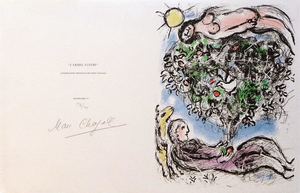
 
http://denisbloch.com/object.php/1285/marc-chagall-arbre-fleuri-lithograph-mourlot-915-louvre-catalogue
Marc Chagall "L'Arbre Fleuri I" - Lithograph - Edition of 100

When an artist prints a limited edition original print, such as a: lithograph, etching, aquatint, carborundum, screenprint, linocut, or woodcut, a set number of identical prints are made. This set number is the "Edition Size," and these will generally be numbered sequentially and hand-signed by the artist. An edition size can vary from extremely small editions of 5 to large editions of 1,000 or more. Open editions have an unknown or unlimited quantity of prints.


http://denisbloch.com/object.php/1104/joan-miro-la-magie-quotidienne-dupin-271-etchings-for-sale
Joan Miro "La Magie Quotidienne" - Etching - Edition of XV on Japon

Sometimes there are different editions printed on different kinds of paper. As an example there may be a regular edition on Arches paper with a limit of 100. These 100 prints are signed and numbered sequentially from 1/100 to 100/100.  In addition to this edition on Arches paper, a smaller edition of 15 are printed on Japon paper and numbered sequentially in roman numerals from I/XV to XV/XV and signed by the artist. This brings our total edition, to 115 prints + any additional proofs that may exist.

So What is a Proof?


A proof is usually an identical print to the regular edition, that is printed at the same time - but is not part of the numbered sequence. This is known as a "Proof Aside from the Edition," and these may or may not be hand-signed by the artist. In general with any edition printed there can be anywhere from 5-50 extra proofs aside from the edition.

Pablo Picasso "Farol (B. 945)" - Linocut - Epreuve d'artiste

Often these extra proofs are retained for the artist, otherwise known as an "Artist Proof". An artist proof can be annotated "A.P." for Artist Proof, or "E.A." in French "Epreuve d'artiste". Sometimes artists can additionally dedicate and gift a proof to a friend, collaborator, dealer, printer, or even family member.


Zao Wou-ki "En Attendant un Jour de Fete (250b)" - Etching - BAT with notes
A "Printer's Proof" designated as "P.P." is much the same, an extra proof made aside of the numbered edition retained by the printer or atelier. The "P.P." can also sometimes stand for "Publisher's Proof". The printer's proof is usually for approval by the master printer to ensure the quality of the printing, and can sometimes include notes and annotations about the printing process. The "BAT" or "Bon à Tirer" is a kind of printer's proof, normally use as a control example against which the other impressions are compared. Bon à Tirer is French for "Good to Print" and is also kept by the Printer or Atelier studio.


Sam Francis "Untitled I (TP)" - Etching - Color Trial Proof

 
Another kind of proof is the "Trial Proof" annotated "T.P." The trial proof is essentially a test proof, often to test colors or the final look of the composition. It is sometimes also referred to as a "working proof" by which the final composition of an edition has not yet been realized. Trial proofs are often thought of as unique prints as they are a one-of-a-kind version of the composition. Art historians, curators, and collectors view working proofs as especially desirable because of their rarity, and the insight they may give into the progress of the work.

http://denisbloch.com/object.php/556/marc-chagall-le-peintre-devant-le-village-mourlot-604
Marc Chagall "Le Peintre devant le Village II" - Lithograph - HC aside from edition

The last form of a "Proof" is the "H.C." which stands for the French term "Hors Commerce" or "Not for Sale". These are exactly as they sound, identical proofs to the regular edition that are not intended to be sold. Prints designated H.C. are often given to the project collaborators as a form of appreciation or partial payment.

Total Tirage

Marc Chagall Catalogue Raisonne Description

"Tirage", the French term meaning "output," is the total number of prints printed for an edition, including any proofs, APs, PPs, HC, and TPs. It is important to note that not every limited edition includes all of these, and the complete number of prints within a tirage are usually described in the artist's Catalogue Raisonné. Some artists and editions are catalogued very well and include full descriptions of the tirage, while others may have basic information only about the numbered edition.


For more information about printmaking and collecting original prints please visit our website:


Saturday, September 27, 2014

Rauschenberg - Signs of the Times

Robert Rauschenberg - Signs - 1970 - Screenprint Signed

Robert Rauschenberg’s“Signs” 1970, is one of the most sought after Rauschenberg screenprints because of the artwork’s incredible iconographic imagery and historical significance. "Signs" was originally commissioned by Time Magazine, with the intention that it would be used as the January edition cover for the year 1970. After considering the final composition, the executives at Time Magazine found the piece was more politically charged than they had hoped and decided against using it. It was felt that the composition, though stunning, was more of a recapitulation of the 1960’s than a welcome to the new decade.

After the dismissal by Time Magazine, Robert Rauschenberg’s trusted dealer Leo Castelli convinced him to print a limited edition screenprint of “Signs”. The edition was published by Leo Castelli in New York in an edition of 250; each signed, dated ‘70’, and numbered in pencil.

“Signs” is an astounding collage encompassing the monumental events and people of 1960’s America. Rauschenberg masterfully juxtaposes scenes of innovation like the moon landing with the destructive violence of the war in Vietnam and the civil rights movement. The revolutionary nature of the era is pronounced through the images of peace protestors at the top, whose rallies for change and peace are echoed by the voice of Janis Joplin deeply singing into her microphone. The iconic leaders of the era including JFK and his brother Bobbie Kennedy challenge the divisive violence of the wars and civil unrest, even as their forms and images transition into the faces of martyrs. The “Signs” of this transformative decade are woven seamlessly by Rauschenberg, and the screen print is known as one of his most important works of art.

National Gallery of Australia


DENIS BLOCH FINE ART is please to offer a number of original
signed prints by Robert Rauschenberg.

Click Here To View The Collection!

Tuesday, July 1, 2014

Art Terms Decoded: What is a Triptych?

Duccio di Buoninsegna c. 1280
"Madonna and Child"
Location: National Gallery, London, England 

The etymological origins of the art term "Triptych" (pronounced "trip-tick") spawns from the Greek adjective τρίπτυχον  or "Three Fold". This perfectly defines the nature of a triptych - which is a three paneled or three sectioned work of art.


Master of Frankfurt c. 1510-1520
"HolyFamily with musical Angel, Saint Catherine of Alexandria, and Saint Barbara"
Location: Museo del Prado, Madrid, Spain
The three pieces in a triptych can be separate pieces or can be conjoined or hinged together. The hinged triptych was an extremely popular and standard format in early Christian alter pieces from the middle ages onward. In these traditional Christian alter pieces the middle panel was generally the largest panel flanked by two smaller panels on either side which could be displayed opened or closed. The center panel was generally the most important scene, often a motif of the Virgin and Child or Jesus, while the smaller side panels were dedicated to admiring saints.

Roy Lichtenstein "As I Opened Fire" 1964

The modern format of the triptych is usually three coordinating pieces on wood panels, canvases, or even works on paper. The three pieces can be different sizes but are often the same size and shape. The triptych composition may consist of three separate images or could also be one composition separated into the three panels. One of the most noted triptychs of the 20th Century is Francis Bacon's triptych painting from 1969, Three Studies of Lucian Freud, which broke the record for the highest price ever paid for an artwork at auction at $142.4 million.

Francis Bacon "Three Studies of Lucien Freud" 1969
 
For more information about fine art collecting and art terms visit our website:


Friday, June 20, 2014

Art Terms Decoded: What does "Stoned Signed" or "Plate Signed" Mean?

Andy Warhol "Marilyn Monroe Castelli Invitation" signed in felt pen.
 
As you begin to delve deeper into the world of fine art collecting you will find that one of the most important indicators of value and potential worth is the artist's signature. Some might even say that this is the most important aspect of an artwork that makes it a desirable luxury commodity.

The reasoning behind the incredible value of the artist's signature above all else, is that a signature is the easiest way to determine the authenticity of a work of art. Many have tried to fake the signature of the great master artists throughout time and sometimes people are fooled - but often expert art dealers, gallerists, curators and appraisers are able to catch a fraudulent mark. A fake signature automatically calls in question the authenticity of the work itself whether it is a painting or original
print.
 

Picasso "Le Vieux Roi" hand-signed in Blue
Picasso "Le Vieux Roi" Plate Signed in Red

From a pure collectorship stand point a hand-signed artwork is going to be the most valuable investment. That is not to say that an unsigned artwork does not have value, it just means the MOST valuable artworks are hand-signed ones.
 
Picasso "Ronde de la Jeunesse" Signed in the Stone
So this brings us to our term "Plate Signed" sometimes also known as "Stone Signed". A plate signed work is specifically referring to an original print or graphic on paper with a printed signature. This is precisely what it sounds like; a plate signature is a signature that is part of the composition and is printed along with the art image. As an example scenario: Pablo Picasso draws an etching composition onto a metal plate - he then signs the plate and dates it - the plate is inked and pressed onto paper and along with his etching Picasso's signature is printed. This would be a "plate signed" original etching.
 
The term "stone signed" is exactly the same but specifically references the stone slabs that might have been used to create an original lithograph. Sometimes artist catalogue raisonnes reference that an edition is "sign in the stone," which is also the same. 
 
The most important take-away in terms of collecting a plate or stoned signed artwork is that it is not equivalent to a hand-signed work and should be valued as such.
 
You can see more of our hand-signed, plate signed, and stoned signed original prints on our website:

Saturday, June 14, 2014

Art Terms Decoded - What does "Acid Free" Mean?

Pablo Picasso Linocut - Perfect Margin Conditions

Have you ever bought an original art print and encountered the term "Acid Free"?  Probably your art dealer or framer mentioned it? Well here is a useful definition of this important art term to give you some insight into protecting and preserving your fine art print investments:

Example of Acid Burn from non-archival framing


The term "Acid Free" refers to the materials used to frame an original artwork. When you frame a work of art - particularly a work on paper you must be extremely careful about the framing materials. Cardboard or regular tape have acidic properties that will eventually over time "burn" the paper or canvas that is exposed to them. The exposure to acidic matting, paper, or even storage materials causes a brown discoloration and deterioration of the paper. Many times the discoloration may occur underneath a frame and cannot be seen.
Pablo Picasso Etching with acid mat burn

When an artwork has been exposed to acidic materials and discolored it seriously devalues the piece. As mentioned in previous posts the investment quality of an artwork is heavily determined by the excellent condition of the piece. That is not to say that a damaged piece has no value, sometimes prints can be restored by a professional paper conservator depending on the level of damage, however this can be an expensive process.

To safely protect your fine art prints and artworks specify to your framer that you want only Acid Free or Archival matting, backboard, and hinging. We additionally recommend UV protective plexi-glas to further preserve your artwork.


For More Information on Art Conservation and Professional Art Terms visit our website: www.denisbloch.com/art_terms.php
 
We also welcome comments and questions regarding archival acid free preservation!
 
info@denisbloch.com / 310-270-4880
 

Thursday, March 6, 2014

Francisco Toledo - Arte Grafica


Francisco Toledo, Nesting Birds, 2009
The Art of Francisco Toledo is deeply influenced by Toledo´s Mexican heritage. Many of Francisco Toledo´s artworks illustrate his Oaxacan roots, exemplified by Toledo´s paintings, sculptures, lithographs, etchings, and drawings of Mexican animals and scenery as well as Mexican History & Mythology.

Mexican artist, Francisco Toledo, was born in Oaxaca, Mexico in 1940. At the age of 12, Francisco Toledo learned the art of engraving at the Escuela de Bellas Artes de Oaxaca. Under the instruction of Guillermo Silva Santamaria at the Centro Superior de Artes Aplicadas del Instituto Nacional de Bellas Artes, Francisco Toledo continued his studies of the graphic arts including: etching, lithography, and engraving.

Francisco Toledo, Sapos Con Frijoles, Etching
In 1959, Francisco Toledo had his first solo art exhibition in Mexico City at Galeria Antonio Souza. Soon after, Toledo traveled to Europe where he began to work at the shop of the renowned British printmaker Stanley William Hayter in Paris. In 1963 Francisco Toledo´s first International art exhibitions were held in Paris at the Galerie Karl Flinker and the Daniel Gervis Gallery. By 1965 Francisco Toledo had exhibited his art in Galleries in Switzerland, Germany, England, Norway and the U.S.A.

Francisco Toledo´s first prints exhibition entitled Toledo Obra Grafica was held in 1969 at the Galeria Juan Martin in Mexico City. As an art medium, graphics (original prints) particularly intrigued Toledo from early in his career because of the extraordinary range of effects available through printing and etching. Among Francisco Toledo´s notable graphic artworks, are Toledo´s series of illustrated art books on Mayan myths.

Francisco Toledo's unique artistic aesthetic is based on a fantastic reality that Toledo finds residing in nature and life. Anthropomorphized animals (that are not often associated with beauty, such as insects, toads, and bats) are often the center–point of Francisco Toledo´s original artworks. Always juxtaposing the beautiful (the grain of the paper beneath Francisco Toledo´s washes of watercolor, or how deep the chroma illuminating Toledo´s small gouaches) with the disturbing.

Francisco Toledo, Crabs & Dogs, Lithograph
Francisco Toledo´s social and cultural concerns about his native state led to his life–long participation in the cultural revitalization within the Mexican community. Francisco Toledo became integrally involved in the establishment of a number of cultural and art institutions including: the Casa de la Cultura in Juchitan 1972, the Instituto de Artes Graficas de Oaxaca (IAGO) 1989, Museo de Arte Contemporaneo de Oaxaca (MACO) 1992, Patronato pro Defensa y Conservacion del Patrimonio Cultural y Natural de Oaxaca (PROOAX) 1993, Centro de la Imagen Manuel Alvarez Bravo, the Biblioteca Jorge Luis Borges for the blind in Oaxaca and the Inaugurates Fonoteca Eduardo Mata in the Centro Fotografico Manuel Alvarez Bravo. Francisco Toledo has also received several accolades for his contributions to the Mexican community including, Mexican National Prize in 1998, the Prince Claus Award in 2000, and the Right Livelihood Award in 2005.

In 1980 the Museo de Arte Moderno in Mexico City held a retrospective of Francisco Toledo´s art. Francisco Toledo´s art is found in the permanent collection of major Art Museums across the globe. Francisco Toledo continues his artistic and humanitarian efforts from Oaxaca City, Mexico.

Select Museum & Institutional Collections:

Metropolitan Museum of Art, New York, NY
Museum of Modern Art, New York, NY
Museo de Arte Contemporaneo de Oaxaca, Oaxaca, Mexico
Museo Tamayo, Mexico City, Mexico
Santa Barbara Museum of Art, Santa Barbara, CA
Fundacion Proa, Buenos Aires, Argentina
Museum of Latin American Art, Long Beach, CA

Saturday, December 7, 2013

Developing the Abstract - Frank Stella Biography

http://www.denisbloch.com/object.php?artist=Frank_Stella&title=Cantahar&artist_id=70&object_id=1043&cat=&medium_id=39&type_id=28
Frank Stella - Cantahar - 1998
American Abstract Artist Frank Stella was born in Malden, MA in 1936. Frank Stella is a highly regarded and collected Abstract artist known for his large–scale freestanding sculptures, architectural structures, and the most complex original prints ever realized in the medium of printmaking.
 
Frank Stella began painting in his sophomore year of high school at the Philips Academy in Andover, MA. Stella continued taking fine art courses at Princeton University, while majoring in history. While in school, Frank Stella visited numerous influential art exhibitions in the galleries of New York City. Frank Stella´s artistic development was directly shaped by the Abstract Expressionism of Jackson Pollock and Franz Kline, and in 1958 Stella moved to New York.  
http://www.tate.org.uk/art/artworks/stella-title-not-known-p78387
Frank Stella - Untitled - 1967
Upon moving to New York City, Stella reacted against the expressive use of paint by most painters of the abstract expressionist movement, instead finding himself drawn towards the "flatter" surfaces of Barnett Newman's art and the "Target" paintings by Jasper Johns. Stella gained early and immediate recognition in 1959 with his series of black pinstriped paintings that turned the gestural brushwork and existential angst of Abstract Expressionism on its head. Several of Frank Stella´s "black paintings" were included in major art exhibitions including: "Three Young Americans" at the Allen Memorial Museum at Oberlin College, and "Sixteen Americans" at the Museum of Modern Art (MOMA) in New York. The Black Paintings served as an important catalyst for Minimalist art of the 1960s.

In 1959 Frank Stella joined fine art dealer Leo Castelli´s gallery of artists, and in 1960 Stella began painting artworks in aluminum and copper paint as well. Stella´s art aesthetic steadily developed as he introduced a wider range of colors, typically arranged in straight or curved lines. Stella eventually created his paintings on shaped canvases (canvases in a shape other than the traditional rectangle or square), often being in L, N, U or T–shapes. In 1965 Frank Stella´s art was included in "The Shaped Canvas" at the Solomon R. Guggenheim Museum, and "Systemic Painting" of 1966. Stella´s shape canvases developed into more elaborate designs, in the Irregular Polygon series of 1967.

http://www.guggenheim.org/new-york/collections/collection-online/artwork/4003
Frank Stella - Harran II - 1967
In 1971 Stella developed his Protractor Series, in which arcs, sometimes overlapping, within square borders are arranged side–by–side to produce full and half circles painted in rings of concentric color. These paintings are named after circular cities he had visited while in the Middle East. Frank Stella´s Irregular Polygon canvases and Protractor Series further extended the concept of the shaped canvas. The shaped canvases took on even less regular forms in the Eccentric Polygon series as elements of collage were introduced. Stella´s artwork became more three–dimensional to the point where he started producing large, free–standing metal wall sculptures. As the 1970s and 1980s progressed, these became more elaborate and exuberant, marked by curving forms, Day–Glo colors, and scrawled brushstrokes. From the mid–1980s to the mid–1990s, Stella created a large body of paintings, sculptures, and original prints that responded in a general way to Herman Melville´s Moby–Dick.


http://www.denisbloch.com/object.php?artist=Frank_Stella&title=Extracts&artist_id=70&object_id=1170&cat=&medium_id=32&type_id=23
Frank Stella - Extracts - 1993
Starting in the mid–1960s Frank Stella launched his extended involvement with printmaking, working first with master printer Kenneth Tyler at Gemini G.E.L. Stella would continue to produce original prints for the duration of his artistic career, and in 1973 he had a print studio installed in his New York house. Frank Stella's abstract prints in lithography, screenprinting, etching and offset lithography had a strong impact upon printmaking as a fine art.


http://www.denisbloch.com/object.php?artist=Frank_Stella&title=Sanor&artist_id=70&object_id=925&cat=&medium_id=32&type_id=23
Frank Stella - Sanor - 1996

Additionally Frank Stella is heralded for his large free–standing sculptures for public spaces from the 1990´s including: the 10,000–square–foot mural for Toronto´s Princess of Wales Theatre; his 5,000–square–foot "Stella Project" which serves as the centerpiece of the theater and lobby of the Moores Opera House on the campus of the University of Houston, in Houston, TX; and Frank Stella´s monumental sculpture was installed outside the National Gallery of Art in Washington, D.C.

Frank Stella's virtually relentless experimentation has made him a key figure in American modernism, helping give rise to such developments as Minimalism, Post–Painterly Abstraction, and Color Field painting. In 2009 Frank Stella was awarded the National Medal of Arts by President Barack Obama, and in 2011 he was awarded the Lifetime Achievement Award in Contemporary Sculpture by the International Sculpture Center. Frank Stella continues to live and work in New York.

"A sculpture is just a painting cut out and stood up somewhere." – Frank Stella

Select Museum Collections:

Art Institute of Chicago
Guggenheim Museum, New York
Hirshhorn Museum and Sculpture Garden, DC
Museum of Fine Arts, Houston
Museum of Modern Art, New York
Norton Simon Museum, Pasadena
Whitney Museum of American Art, New York
San Francisco Museum of Modern Art
Fukuoka Art Museum, Japan
Museum of Contemporary Art, Los Angeles
Tate Gallery, London

Saturday, October 26, 2013

IS ART A GOOD INVESTMENT?


There are a number of indicators that prove that Fine Art, carefully selected, can be a lucrative commodity investment. Art is one of the most enticing hard asset investments, as collectors have created a hefty supply and demand system throughout the years.

According to Michael Moses, a retired New York University business school professor who co-
Marc Chagall
created the Mei Moses World All Art Index, over the past 60 years, the total return on fine art has been very similar to the return on the S&P 500-stock index. "If you use the last 30 years, the S&P substantially outperforms art," Moses says. "If you look at the most recent eight [to] 10 years, art has outperformed the S&P."


Another reason to consider investing in Art is that Fine Art has a proven track record as a good choice during hard times. Fine Art is more or less resilient to times of economic turmoil and trouble. It has outperformed during all of the wars of the 20th century, and has outperformed during the last 27 recessions. One of the biggest draws to this asset class is the fact that there is no underlying financial market to tinker with prices. There will never be a bad trade or a flash crash that will suddenly erase the value of your art investment. Though it is not a guarantee, Art also has the potential to appreciate with time.


The last and perhaps most rewarding aspect of collecting Fine Art are the emotional and aesthetic rewards. Because Art is a physical asset class, your investment is something that you can potentially enjoy every day.


COLLECTING THE RIGHT ARTIST

The greatest draw back to investing in fine art is the relative unpredictability of the performance an artist’s body of work might have. Like other markets there are artists and artworks that are highly unlikely to retain or develop future value, and so it is very important as a beginning collector to be highly selective of the artists you collect. The best advice is that you select artists with established markets. A blue-chip artist would have a major following, specifically by academic and museum interest. The Artist is your best indicator for potential value.

Pablo Picasso
Normally a museum artist like Picasso, Warhol, or Hockney would be out of range for the average
collector, but through the limited edition prints market you can attain these artists for a few thousand dollars as opposed to a few million. Many collectors and art dealers will tell you that originals will always perform better than prints, and this is half true. The original paintings for Pablo Picasso or Damien Hirst will always outperform the graphic artworks for these artists certainly, and if you have the capital to invest in high-level paintings of Museum Masters, I strongly recommend that this is the market you seek. However, an original painting by an immerging and unknown artist vs. an establish master’s print will not necessarily hold value or outperform the print. The performance of an original painting depends heavily on the current market and demand for the artist.


COLLECTING THE RIGHT PIECE

Aside from the Artist, other excellent indicators of future potential rest on the work itself. It is true that some compositions are simply more aesthetic than others. Some artworks may bear iconic images and characteristics of an artist’s specific period or style. It can be beneficial to research an artist’s backstory, as it can have a fair amount of weight in the resale value of a piece. Additionally if you are collecting sculptures or original prints the edition sizes can also play a major factor. When deciding what art to buy, the most important is that you enjoy and appreciate the art.


Wednesday, May 8, 2013

ZAO WOU-KI


CELEBRATING THE ABSTRACT EXPRESSIONIST

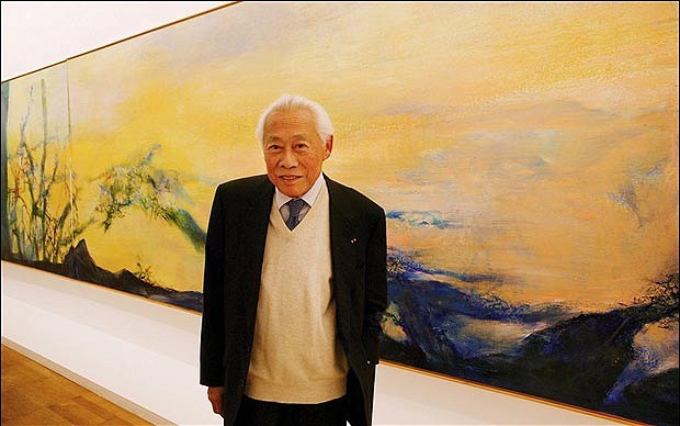
Zao Wou-ki with painting - Getty Image
Chinese – French Artist Zao Wou – ki was born in Beijing, China in 1921. Zao´s given name, "Wou – ki" (or "Wuji" in the standard Hanyu Pinyin romanization used in China), translates to "no boundaries." This perfectly encapsulates Zao Wou–ki as an artist, who was uniquely able to combine the cultures and aesthetic visions of France and China in his Fine art paintings, prints, etchings, and lithography.


Zao Wou-ki - Suite Beauregard - 1981 - Etching
Zao Wou – Ki went to school in Nantung, a small town north of Shanghai, where his father worked as a banker. Zao Wou–ki was considered a gifted pupil and he took great interest in literature and in Chinese and world history. Zao Wou – ki´s family was one of intellectuals who appreciated painting and fine art, and Wou–Ki would learn the traditional Chinese art of calligraphy from his grandfather.
From the age of ten Zao Wou–ki created drawings and paintings constantly. In 1935, at the age of fourteen, Zao Wou–Ki was admitted to the School of Fine Arts at Hangzhou, China. There Zao Wou – ki studied life drawing, oil painting, and also received instruction in the theories of calligraphy and western perspective. Despite the traditional teachings in accuracy and realism, Zao Wuji sought to capture the broad outlines and essence in his artwork compositions.

Zao Wou–Ki was appointed lecturer at the School of Fine Arts and in 1941 held his first art exhibition. According to Wou–Ki "To tell the truth, the [Paintings] I showed were strongly influenced by Matisse and Picasso. My harlequins recalled the ‘Blue Period´, my statue women the ‘Greek Period´." Indeed it was in the artworks of Cezanne, Matisse and Picasso that Zao Wou–Ki would find the vision he considered closest to nature. Inspired by his collection of postcards of reproduced French paintings and full page illustrations of Renoir, Modigliani, Cezanne, Matisse and Picasso artworks in American magazines, Zao Wou–ki developed his artistic approach.

 In 1947, the twenty–seven year old Zao Wou–Ki decided to leave China for Paris. Zao Wou–ki and his wife, Lan–Lan, sailed from Shanghai in early 1948 and after a voyage of 36 days, arrived in Paris, France where Zao Wou–Ki spent his first afternoon at the Louvre Art Museum. Zao Wou – ki settled in a studio near that of Alberto Giacometti; took French lessons; and visited and saw everything he could in Paris. The city inspired him and Zao Wou–ki easily frequented a circle of international artists, writers and intellectuals. While in Paris, Zao Wou–ki acquainted himself with European Lyrical Abstraction, a movement of postwar French artists pursuing free–form abstract expression through painting.

In 1949, Zao Wou–ki began making art prints after learning the technique of lithography at the Atelier Desjobert. The lithograph medium delighted Zao Wou – ki ––"The idea of throwing color on a large white stone, like on China paper, pleased me…," and Zao Wou–ki´s print experiments became lithographic masterpieces. In 1950 Zao Wou–ki published his prints accompanied by poems from celebrated poet Henri Michaux in 1950.

Zao Wou-ki - Flore et Faune - 1951 - Etching
Zao Wou–ki´s collaboration with Henri Michaux pushed him to review his Indian ink techniques and his roots in Chinese traditional drawing. Upon discovering Paul Klee´s paintings in 1951, Zao Wou–ki began to incorporate ideograms into his paintings, drawings, and prints. Zao Wuji still painted figurative elements, however, before he definitively committed to an Abstract painting aesthetic in 1953, inspired by archaic Chinese characters. Zao Wou–Ki had unknowingly come full circle back to traditional Chinese calligraphy – carefully drawing out each character with great passion and emotion.

Zao Wou-ki - Éloge des choses extrêmement légères - 1993 - Etching
Zao Wou–Ki travelled extensively in the 1950–1960s discovering and exhibiting in Italy, Spain, the United States, Japan, Greece, Switzerland and England. In 1950 Zao participated for the first time in the Salon de Mai, at which he was to exhibit regularly every year after that. Zao Wou–ki´s would befriended artists such as Rufino Tamayo and Joan Miro, as well as, architect I.M. Pei. In 1993 he was appointed Commander of the Legion of Honor by the President of France and the following year was awarded the Premium Imperial Award of Painting in Japan.
Zao Wou-ki - Village en fête - Oil on canvas - 1954

Zao Wou – ki was regarded as one of foremost Chinese Contemporary painters of the 20th century.By the end of his life Zao Wou–ki had stopped producing new artworks due to health problems. He died on April 9th, 2013 at his home in Switzerland.

"How to represent the wind? How to paint emptiness? And the light, its brightness, its purity? I did not want to reproduce but to juxtapose forms, to assemble them in order to find in them the whispering wind over still water." ~ Zao Wou–ki

Select Museum Collections:
Metropolitan Museum of Art, NYC
Guggenheim Museum, NYC
Georges Pompidou Centre, Paris
Musee des Beaux–Arts, Montreal
Art Institute of Chicago, IL
Museum of Modern Art, NYC
Museo de Arte Moderno, Mexico
National Institute of Fine Arts, Beijing
Fundacio Joan Miro, Barcelona

Wednesday, October 17, 2012

Speedy Graphito - Technical Temptation

Speedy Graphito, City Love, Painting on Canvas
Street Art pioneer Speedy Graphito was born in Paris in 1961. Speedy Graphito began his art career in the 1980´s on the streets of Paris, creating dynamic paintings and street murals using spray paint and stencils.


Speedy Graphito, Toxic Game,
Screenprint Unique on Paper
Originally a graphic designer and art director, Speedy Graphito quickly established a distinct urban art style that incorporates schematic and charasmatic characters, cartoons and manga alongside contemporary commercial brands, logos, and iconic pop culture imagery. Speedy Graphito´s art is inspired by the virtual and physical urbanscape, but predominantly the barrage of advertising that dominates today´s consumer culture. Street Artist Speedy Graphito has become recognized and revered for his satirical exploration of commercialism, often turning a critical eye on our society through his pop graffiti art.
Speedy Graphito, Temptation,
Screenprint on Paper
Particularly influenced by the iconography of Disney characters and video games, street artist Speedy Graphito often turns a critical eye on our society, as his artworks feed off the collective memory of iconic imagery to create a new universal language. As an example, Speedy Graphito´s "Temptation 2011" features Disney´s Snow White enamored with the half–eaten logo of Macintosh Apple, creating a shrewd and satirical criticism of consumer seduction.

An astute representation of social communication in the internet era, Speedy Graphito's "Snow White" screenprint mirrors our media and technology dominant social intercourse. Our new social experience is saturated by both text and pictoral messages, echoing the layers of an inundated graffiti wall. The seduction is explicated beyond Snow White and the Apple Logo, but further distinguishes our mass enchantment with a technological world at our finger-tips - just a click away from satisfaction.  


Speedy Graphito, Money, Painting on Canvas
Speedy Graphito´s paintings, prints, and street art murals can be found worldwide. Already recognized in the international arena, Speedy Graphito´s Art is well known in France, England, USA, Belgium, India, Japan, Brazil, and Dubai, as well as major auction houses. Speedy Graphito has recently participated in a number of solo art exhibitions in Los Angeles Art Galleries, as well as exhibiting at the 2011 Miami Art Basel.

Denis Bloch Fine Art is pleased to offer original paintings, drawings, limited edition screenprints, and unique prints by Street Artist Speedy Graphito.