Showing posts with label Aquatint. Show all posts

Thursday, March 6, 2014

Francisco Toledo - Arte Grafica


Francisco Toledo, Nesting Birds, 2009
The Art of Francisco Toledo is deeply influenced by Toledo´s Mexican heritage. Many of Francisco Toledo´s artworks illustrate his Oaxacan roots, exemplified by Toledo´s paintings, sculptures, lithographs, etchings, and drawings of Mexican animals and scenery as well as Mexican History & Mythology.

Mexican artist, Francisco Toledo, was born in Oaxaca, Mexico in 1940. At the age of 12, Francisco Toledo learned the art of engraving at the Escuela de Bellas Artes de Oaxaca. Under the instruction of Guillermo Silva Santamaria at the Centro Superior de Artes Aplicadas del Instituto Nacional de Bellas Artes, Francisco Toledo continued his studies of the graphic arts including: etching, lithography, and engraving.

Francisco Toledo, Sapos Con Frijoles, Etching
In 1959, Francisco Toledo had his first solo art exhibition in Mexico City at Galeria Antonio Souza. Soon after, Toledo traveled to Europe where he began to work at the shop of the renowned British printmaker Stanley William Hayter in Paris. In 1963 Francisco Toledo´s first International art exhibitions were held in Paris at the Galerie Karl Flinker and the Daniel Gervis Gallery. By 1965 Francisco Toledo had exhibited his art in Galleries in Switzerland, Germany, England, Norway and the U.S.A.

Francisco Toledo´s first prints exhibition entitled Toledo Obra Grafica was held in 1969 at the Galeria Juan Martin in Mexico City. As an art medium, graphics (original prints) particularly intrigued Toledo from early in his career because of the extraordinary range of effects available through printing and etching. Among Francisco Toledo´s notable graphic artworks, are Toledo´s series of illustrated art books on Mayan myths.

Francisco Toledo's unique artistic aesthetic is based on a fantastic reality that Toledo finds residing in nature and life. Anthropomorphized animals (that are not often associated with beauty, such as insects, toads, and bats) are often the center–point of Francisco Toledo´s original artworks. Always juxtaposing the beautiful (the grain of the paper beneath Francisco Toledo´s washes of watercolor, or how deep the chroma illuminating Toledo´s small gouaches) with the disturbing.

Francisco Toledo, Crabs & Dogs, Lithograph
Francisco Toledo´s social and cultural concerns about his native state led to his life–long participation in the cultural revitalization within the Mexican community. Francisco Toledo became integrally involved in the establishment of a number of cultural and art institutions including: the Casa de la Cultura in Juchitan 1972, the Instituto de Artes Graficas de Oaxaca (IAGO) 1989, Museo de Arte Contemporaneo de Oaxaca (MACO) 1992, Patronato pro Defensa y Conservacion del Patrimonio Cultural y Natural de Oaxaca (PROOAX) 1993, Centro de la Imagen Manuel Alvarez Bravo, the Biblioteca Jorge Luis Borges for the blind in Oaxaca and the Inaugurates Fonoteca Eduardo Mata in the Centro Fotografico Manuel Alvarez Bravo. Francisco Toledo has also received several accolades for his contributions to the Mexican community including, Mexican National Prize in 1998, the Prince Claus Award in 2000, and the Right Livelihood Award in 2005.

In 1980 the Museo de Arte Moderno in Mexico City held a retrospective of Francisco Toledo´s art. Francisco Toledo´s art is found in the permanent collection of major Art Museums across the globe. Francisco Toledo continues his artistic and humanitarian efforts from Oaxaca City, Mexico.

Select Museum & Institutional Collections:

Metropolitan Museum of Art, New York, NY
Museum of Modern Art, New York, NY
Museo de Arte Contemporaneo de Oaxaca, Oaxaca, Mexico
Museo Tamayo, Mexico City, Mexico
Santa Barbara Museum of Art, Santa Barbara, CA
Fundacion Proa, Buenos Aires, Argentina
Museum of Latin American Art, Long Beach, CA

Wednesday, May 8, 2013

ZAO WOU-KI


CELEBRATING THE ABSTRACT EXPRESSIONIST

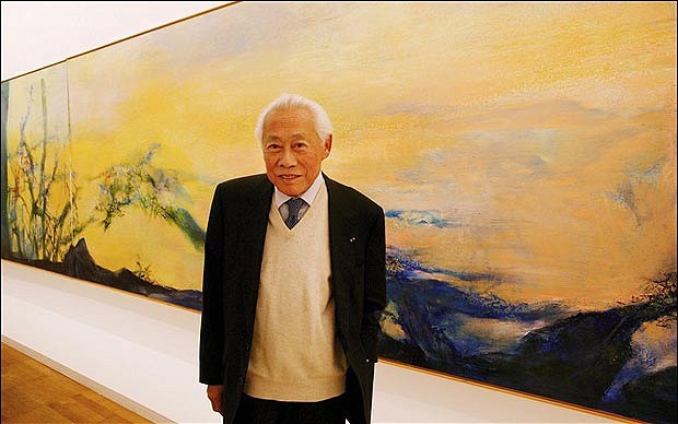
Zao Wou-ki with painting - Getty Image
Chinese – French Artist Zao Wou – ki was born in Beijing, China in 1921. Zao´s given name, "Wou – ki" (or "Wuji" in the standard Hanyu Pinyin romanization used in China), translates to "no boundaries." This perfectly encapsulates Zao Wou–ki as an artist, who was uniquely able to combine the cultures and aesthetic visions of France and China in his Fine art paintings, prints, etchings, and lithography.


Zao Wou-ki - Suite Beauregard - 1981 - Etching
Zao Wou – Ki went to school in Nantung, a small town north of Shanghai, where his father worked as a banker. Zao Wou–ki was considered a gifted pupil and he took great interest in literature and in Chinese and world history. Zao Wou – ki´s family was one of intellectuals who appreciated painting and fine art, and Wou–Ki would learn the traditional Chinese art of calligraphy from his grandfather.
From the age of ten Zao Wou–ki created drawings and paintings constantly. In 1935, at the age of fourteen, Zao Wou–Ki was admitted to the School of Fine Arts at Hangzhou, China. There Zao Wou – ki studied life drawing, oil painting, and also received instruction in the theories of calligraphy and western perspective. Despite the traditional teachings in accuracy and realism, Zao Wuji sought to capture the broad outlines and essence in his artwork compositions.

Zao Wou–Ki was appointed lecturer at the School of Fine Arts and in 1941 held his first art exhibition. According to Wou–Ki "To tell the truth, the [Paintings] I showed were strongly influenced by Matisse and Picasso. My harlequins recalled the ‘Blue Period´, my statue women the ‘Greek Period´." Indeed it was in the artworks of Cezanne, Matisse and Picasso that Zao Wou–Ki would find the vision he considered closest to nature. Inspired by his collection of postcards of reproduced French paintings and full page illustrations of Renoir, Modigliani, Cezanne, Matisse and Picasso artworks in American magazines, Zao Wou–ki developed his artistic approach.

 In 1947, the twenty–seven year old Zao Wou–Ki decided to leave China for Paris. Zao Wou–ki and his wife, Lan–Lan, sailed from Shanghai in early 1948 and after a voyage of 36 days, arrived in Paris, France where Zao Wou–Ki spent his first afternoon at the Louvre Art Museum. Zao Wou – ki settled in a studio near that of Alberto Giacometti; took French lessons; and visited and saw everything he could in Paris. The city inspired him and Zao Wou–ki easily frequented a circle of international artists, writers and intellectuals. While in Paris, Zao Wou–ki acquainted himself with European Lyrical Abstraction, a movement of postwar French artists pursuing free–form abstract expression through painting.

In 1949, Zao Wou–ki began making art prints after learning the technique of lithography at the Atelier Desjobert. The lithograph medium delighted Zao Wou – ki ––"The idea of throwing color on a large white stone, like on China paper, pleased me…," and Zao Wou–ki´s print experiments became lithographic masterpieces. In 1950 Zao Wou–ki published his prints accompanied by poems from celebrated poet Henri Michaux in 1950.

Zao Wou-ki - Flore et Faune - 1951 - Etching
Zao Wou–ki´s collaboration with Henri Michaux pushed him to review his Indian ink techniques and his roots in Chinese traditional drawing. Upon discovering Paul Klee´s paintings in 1951, Zao Wou–ki began to incorporate ideograms into his paintings, drawings, and prints. Zao Wuji still painted figurative elements, however, before he definitively committed to an Abstract painting aesthetic in 1953, inspired by archaic Chinese characters. Zao Wou–Ki had unknowingly come full circle back to traditional Chinese calligraphy – carefully drawing out each character with great passion and emotion.

Zao Wou-ki - Éloge des choses extrêmement légères - 1993 - Etching
Zao Wou–Ki travelled extensively in the 1950–1960s discovering and exhibiting in Italy, Spain, the United States, Japan, Greece, Switzerland and England. In 1950 Zao participated for the first time in the Salon de Mai, at which he was to exhibit regularly every year after that. Zao Wou–ki´s would befriended artists such as Rufino Tamayo and Joan Miro, as well as, architect I.M. Pei. In 1993 he was appointed Commander of the Legion of Honor by the President of France and the following year was awarded the Premium Imperial Award of Painting in Japan.
Zao Wou-ki - Village en fête - Oil on canvas - 1954

Zao Wou – ki was regarded as one of foremost Chinese Contemporary painters of the 20th century.By the end of his life Zao Wou–ki had stopped producing new artworks due to health problems. He died on April 9th, 2013 at his home in Switzerland.

"How to represent the wind? How to paint emptiness? And the light, its brightness, its purity? I did not want to reproduce but to juxtapose forms, to assemble them in order to find in them the whispering wind over still water." ~ Zao Wou–ki

Select Museum Collections:
Metropolitan Museum of Art, NYC
Guggenheim Museum, NYC
Georges Pompidou Centre, Paris
Musee des Beaux–Arts, Montreal
Art Institute of Chicago, IL
Museum of Modern Art, NYC
Museo de Arte Moderno, Mexico
National Institute of Fine Arts, Beijing
Fundacio Joan Miro, Barcelona

Tuesday, December 27, 2011

Sam Francis – Space and Color

Sam Francis - Trietto II - Aquatint Print
“Painting is about the beauty of space and the power of containment.” – Sam Francis

Sam Francis with Wallse Ting in studio
American Abstract Artist Sam Francis was late to start his successful and brilliant career as a painter and printmaker. While serving as a pilot in the United States Air Force during WWII, Sam Francis suffered an injury that hospitalized him for several years. While recovering, Sam Francis began to paint over the side of his hospital bed to escape the mundane routine of the hospital as well as the pains of his aching body. Developing a love for art and finding an artistic voice was healing for Sam Francis, and the art created in this time had an astonishing remedial effect on Sam Francis’ mental and emotional state.

Sam Francis - Untitled SF345
Lithograph
Sam Francis’ experience as a pilot had a unique bearing on his paintings and prints, which often utilized aerial perspectives to communicate the silence of the skies. Sam Francis’ aerial approach to the canvas became paramount to his methodology as a painter, as well as a signature style for Sam Francis.

During the late 1940s, Sam Francis began producing and exhibiting his earliest abstract artworks. Francis was initially influenced by the work of the Abstract Expressionists, like Mark Rothko and Arshile Gorky, and Sam Francis incorporated many of their techniques and ideas in his art. Despite this influence, Sam Francis’ art was also in close dialogue with modern and contemporary French art. His references ranged from the Water Lilies of Claude Monet, which inspired many of Sam Francis ideas about atmosphere and space, to Pierre Bonnard and Henri Matisse, whose conceptions of pure color were particularly resonant with Francis.

Sam Francis - Pasadena Box (Plate 8)
Lithograph Print
While traveling to Japan during the 1950’s, Sam Francis became interested in Japanese calligraphy and art, particularly the Japanese use of negative space. Sam Francis was acutely aware of the dialogue between color and space on the canvas. In many of Sam Francis’ prints and paintings from the 1960’s the brushwork is relegated to the outer edges, leaving vast empty spaces in the center of each art piece. The negative space, or silence within Sam Francis’ art is as meaningful as Francis’ fluid brushwork of radiant color.

“Color is a kind of holy substance for me,” Francis said. “It’s the element in painting which I am most fascinated with. It is an element of painting which overcomes me. . . . Color in a way is a receptacle for a feeling and a way for you to hold it until understanding arrives or meaning is extracted.” Sam Francis’ artwork further investigated perceptions of light and color by contrasting glowing jewel tones with large areas of white. White in Sam Francis’ art does not function simply as a ground against which he applies color. Rather, the white areas are dynamically engaged in active communication with the colors. For Francis each color had a symbolic value: white corresponded to the infinite, blue to the cosmos and water, and yellow to the sun.

Sam Francis - Untitled - Monotype
Considered one of the premier colorists of the twentieth century, Sam Francis is best known for dramatic, lushly painted works comprised of vivid pools of color, thinly applied. Sam Francis has also been compared to Color Field artists on the basis of large, fluid sections of paint that seem to extend beyond the confines of the pictorial surface. Sam Francis’ art is a dynamic and sophisticated juxtaposition between color and space, a luminous conversation played out in strokes of lush color.

Visit our website for more available prints by Sam Francis.

Tuesday, June 21, 2011

Sonia Delaunay Biography: Textiles, Design, and Prints


Sonia Delaunay Original Print -
Composition with Semi-circles

Artist Sonia Delaunay-Terk was born in present day Ukraine on November 14th, 1885 under the surname Stern. At a young age Sonia Delaunay moved to St. Petersburg, where she was cared for by her mother's brother, Henri Terk, a successful and affluent Jewish lawyer. Henri Terk and his wife Anna adopted Sonia Delaunay in 1890 when she assumed the name Sonia Terk. Sonia Delaunay-Terk received a privileged upbringing with the Terks, traveling widely throughout Europe where Sonia Delaunay was introduced to art museums and art galleries.

Sonia Delaunay Etching -
Composition with Circles
When Sonia Delaunay was 18, she was sent to study art at the Academy of Fine Arts in Karlsruhe, Germany. Sonia Delaunay studied in at the Art Academy until 1905 when she decided to join the Modern Art movement at Montparnasse in Paris. Sonia Delaunay was deeply influenced by the post-impressionist art of Van-Gogh, Gauguin, and Henri Rousseau as well as the artists of the Fauves group including Henri Matisse.

During Sonia Delaunay’s first year in Paris Sonia Delaunay met, and married, German homosexual art gallery owner Wilhelm Uhde. It is assumed that Sonia Delaunay’s marriage to Uhde was a marriage of convenience to escape the demands of her parents, who disliked her artistic career. Through Uhde's gallery Sonia Delaunay gained entrance into the Parisian art world and benefitted from his connections, and Uhde masked his homosexuality through his public marriage to Sonia. Through her connections Sonia Delaunay met prominent artists of the modern art movement including: Pablo Picasso, Georges Braque, Georges Rouault, and Maurice de Vlaminck.

Sonia Delaunay met painter Robert Delaunay in early 1909. Sonia and Robert became lovers in April of the same year and it was decided that Sonia Delaunay and Uhde should divorce. The divorce was finalized in August 1910. In November of 1910 Sonia and Robert Delaunay were married. Sonia Delaunay was pregnant with their son Charles who was born on January 18, 1911. Sonia Delaunay made a patchwork quilt for Charles' crib, which is now in the collection of the Musee National d'Art Moderne in Paris. Sonia Delaunay’s quilt was created spontaneously and exemplifies Sonia Delaunay’s use of geometry and color in her textiles, paintings, and original prints.

Sonia Delaunay Aquatint -
Composition with Triangles
Contemporary art critics recognize this as the point where Sonia Delaunay moved away from perspective and naturalism in her art. Robert & Sonia Delaunay became associated with the development of Orphism, a highly abstract art movement which paralleled the geometry of Cubism but with a much brighter color palette. It is said that artist Paul Klee was so taken with Sonia Delaunay’s’ patterning of squares from a 1912 illustrated book, that they became an enduring feature in Klee’s own art.
During the 1910-1920s, Sonia Delaunay focused on bringing this new artistic lyricism into the world of design, transforming Art Deco fabrics into vibrant high fashion clothing, wall coverings, furniture textiles as well as, theatrical costumes. In 1917 Sonia Delaunay met Sergei Diaghilev, and Sonia Delaunay designed costumes for his productions of Cleopatra and Aida.
The Russian Revolution brought an end to the financial support Robert & Sonia Delaunay received from Sonia’s family in Russia, and a different source of income was needed. Sonia Delaunay made clothes for private clients and friends, and in 1923 created fifty fabric designs using geometrical shapes and bold colors, commissioned by a manufacturer from Lyon. Sonia Delaunay’s customers included Nancy Cunard, Gloria Swanson, Lucienne Bogaert and Gabrielle Dorziat.

In the 1930s, Sonia Delaunay returned her focus on painting, joining the Abstraction-Creation group in seeking to create an art based upon non-representational elements, often geometrical, and continuing to focus on color as central to painting. The group was trans-national, and including among its members: Jean Arp, Barbara Hepworth, Wassily Kandinsky and Piet Mondrian. In 1937 Sonia & Robert Delaunay collaborated on a mural for the Exposition Internationale des Arts et Techniques dans la Vie Moderne.

Sonia Delaunay Print -
Geometric Composition
In 1941 Robert Delaunay died of cancer. After Robert death, Sonia Delaunay continued to work and exhibit regularly as a painter & designer, turning often to printmaking including: etchings, lithographs, and pochoirs prints. In 1963 Sonia Delaunay donated 58 of her own works and 40 of Robert Delaunay’s to the Musee National d'Art Moderne, Paris. Sonia Delaunay became the first woman ever to be exhibited at the Louvre during her lifetime when the museum mounted an exhibition of the works in 1964.

In 1966 Sonia Delaunay printed Rythmes-Couleurs with 11 of her gouaches produced as pochoir prints, with texts by Jacques Damase. In 1969 Sonia Delaunay printed Robes poemes, also with texts by Jacques Damase containing 27 Sonia Delaunay prints.

Sonia Delaunay-Terk died in 1979 at the age of 94 with no regrets in her life.

Sonia Delaunay’s work in modern design included the use of geometric abstraction in the integration of furniture, fabrics, wall coverings, clothing, prints, lithographs, and etchings.

Sonia Delaunay was the subject of a recent Exhibition at the Cooper Hewitt National Design Museum.


Select Museum Collections:
Hermitage Museum, St. Petersburg
Museum of Modern Art, New York
Art Institute of Chicago, Chicago
Metropolitan Museum of Art, New York
Hirshhorn Museum & Sculpture Garden, DC
Tate Gallery, London
Reina Sofia National Museum, Madrid
Louvre, Paris

Saturday, February 19, 2011

RUFINO TAMAYO & MIXOGRAFIA PRINTS


Perro de Luna, 1973 LITHOGRAPH
Rufino Tamayo’s legacy to the history of art is truly found in Tamayo’s oeuvre of graphic prints, in which Tamayo cultivated every technique. A truly innovative print-maker, Rufino Tamayo’s graphic work was produced between 1925 and 1991 and includes the mediums of woodcuts, lithographs, etchings, aquatints, and mixografia prints.


Niña, 1981 MIXOGRAPH
In the early 1970's, printer Luis Remba approached Rufino Tamayo to produce a series of lithographs. Although Tamayo was interested, he made it clear that he was looking for new horizons within the medium - particularly seeking ways to get more volume and texture into his original prints. Together Luis Remba & Rufino Tamayo expanded the technical and aesthetic possibilities of the graphic arts by developing a new genre of multiples, which they named Mixografia.


Dos Hermanos, 1987 MIXOGRAPH
The Mixografia technique is a unique fine art printing process that allows for the production of prints with three-dimensional texture. The quality of a Mixografia print is similar to that of a fresco or bas-relief, in which the surface of the paper has a kind of sculptural depth. The technique not only registered the texture and volume of Rufino Tamayo's design, but it also granted Tamayo the freedom to use any combination of solid materials in its creation. Rufino Tamayo was delighted with the Mixografia process, and Tamayo created some 80 Original Mixographs over his lifetime.

Due to the inability of commercial paper to withstand the stress of the Mixografia three-dimensional printing technique, a more resilient handmade paper was also invented. The paper of a Mixografia print has a heavy and thick consistency that further enhances the sculptural three-dimensionality of a Mixografia print.


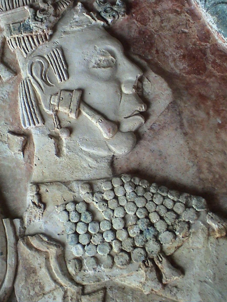
Relief Sculpture from Pelenque Ruins
Greatly influenced by his Mexican and Zapotec heritage, much of Rufino Tamayo’s artwork, particularly Tamayo’s Mixografia prints, illustrate the same weight and feel of Pre-Columbian stone reliefs and sculptures. Rufino Tamayo became interested in Pre-Columbian art as early as 1926, when Tamayo became the head of the department of ethnographic drawing at the National Museum of Archaeology in Mexico City.


Nocturno, 1975 ETCHING
Most of the compositions in Rufino Tamayo’s original graphics are extremely simple yet highly inventive in their technicality. Tamayo was known for taking an elementary drawing and filling it with structural elements, textures and colors obtaining striking etchings, lithographs and mixographs created with eloquent and economical expression.

Hombre, 1979 LITHOGRAPH
Rufino Tamayo was one of the first artists in Latin America to interpret his roots without historicism, anecdote, or proclamation. In doing so, Rufino Tamayo formed one of the most brilliant chapters of the already rich and prestigious field of original graphic art in Mexico.


To view the gallery’s collection of available Rufino Tamayo
Prints please visit our website:


Saturday, October 30, 2010

Georges Braque Biography

“Once an object has been incorporated in a picture it accepts a new destiny.” – Georges Braque

Oiseau Blanc, 1961 , Ceramic Plaque
Artist Georges Braque was born on May 13, 1882, in Argenteuil sur Seine, France. The son of a house decorator, Georges Braque received his first art lessons in painting from his father. In 1890 the Braque family moved to Le Havre, where Georges Braque would attend evening art classes at the Ecole des Beaux-Arts from about 1897 to 1899. At the age of 19, Georges Braque left for Paris to get a craftsman certificate.

From 1902 to 1904, Georges Braque studied art at the Academie Humbert in Paris, where Braque met artists Marie Laurencin and Francis Picabia. By 1906, Georges Braque had evolved his art from the Impressionist style into the bolder Fauvist style. Georges Braque showed Fauvist works of art the following year in the Salon des Independants in Paris. Georges Braque had his first solo art show at Daniel-Henri Kahnweiler’s gallery in 1908.

In 1909, Georges Braque began to work very closely with artist and collegue Pablo Picasso, as the two artists’ styles were becoming very similar. Both Braque and Picasso’s art showed an increased interest in geometry and simultaneous perspective, and by 1911 Georges Braque and Pablo Picasso had developed the artistic style of Cubism. One of Picasso's many pet names for Georges Braque was 'Vilbour' or 'Wilbourg', a reference to Wilbur Wright. Pablo Picasso saw in their 1908-1914 creative art partnership something that was akin to the brothers Wilbur and Orville Wright, the pioneers of sustained powered flight. In 1912, Georges Braque and Pablo Picasso started to incorporate collage elements into their art and to experiment with the papier colle (pasted paper) technique, in which Barque utilized a roll of wallpaper found in a local shop. Braque and Picasso’s productive collaboration continued until the outbreak of World War I in 1914.

Georges Braque served with honor in the French army during World War I and was seriously wounded in the head, leaving Braque temporarily blinded and unable to create art. Upon recovering in 1917, Georges Braque began a close friendship with cubist artist Juan Gris.

Theiere et Fruits, c. 1950 , Collotype


After the war Georges Braque became freer and less schematic in his art, moving away from the harsher abstraction of Cubism. Braque painted many still life subjects during this time, maintaining an emphasis on structure. In 1922 Georges Braque had an art exhibition at the Salon d’Automne in Paris that brought Braque great fame and recognition. During the mid-1920s, Georges Braque designed the art decor for two Sergei Diaghilev ballets. By the end of the decade, Georges Braque had returned to a more realistic interpretation of nature, although certain aspects of Cubism always remained present in Braque’s art.

 In 1931, Georges Braque created his first engraved plasters and began to portray mythological subjects. Georges Braque had his first important art retrospective in 1933 at the Kunsthalle Basel. In 1937 Braque won First Prize at the Carnegie International, in Pittsburgh.


Georges Braque at his studio with Mourlot and Master Printers, 1962

During World War II, Georges Braque remained in Paris. During this period Braque primarily painted still-lifes and interiors, and Braque’s art became more and more somber as the war continued. From the late 1940s Georges Braque created numerous lithographs, engravings, and sculptures where, Braque utilized recurring themes of birds, ateliers, landscapes, and seascapes. Georges Braque, along with Henri Matisse, is credited for introducing Pablo Picasso to Fernand Mourlot, and most of the lithographs, illustrated books, and original prints Braque created in the 1940s and '50s were produced at the Mourlot Lithography Studios. In 1948 Georges Braque was awarded the main prize for painting at the Venice Biennale, and in 1951 Braque was made a Commander of the Legion of Honour. A few years later, Braque employed his skills as a craftsman, when Braque designed stained-glass windows for the church of Varengeville and painted the ceiling for the Etruscan Gallery at The Louvre. In 1961 George Braque had the distinction of being the first living artist to have his art exhibited at The Louvre.


Louvre I , c. 1955, Lithograph


Louvre IV, c. 1955, Lithograph

During the last few years of Braque’s life, ill health prevented Braque from undertaking further large-scale commissions, but Baroque continued to paint, create lithographs, and design jewelry. Georges Braque died on August 31, 1963, in Paris with his wife, Marcelle, at his side.

Saturday, October 16, 2010

Joan Miro and Carborundum Etchings

Trace sur la Paroi IV, 1967
Etching, Aquatint with Carborundum
73.5 x 104 cm
 Throughout his life, Artist Joan Miro worked in several printmaking processes, including engraving, lithography and etching, as well as the use of stencils (called pochoir). Joan Miro stated that printmaking made his paintings richer, and gave him new ideas for his art. 


Exile Vert, 1969
Etching, Aquatint with Carborundum
102.5 x 70 cm
A major breakthrough for Miro's graphic work arrived through an introduction, by renowned master printmaker Robert Dutrou, to carborundum (silicon carbide engraving) in 1967. The Carborundum printmaking process, pioneered by Henri Goetz, is an engraving technique requiring the use of an abrasive ground (carborundum) added to the etching plate to create a granulated or textured surface. Joan Miro found that by combining this new technique with other etching methods, especially aquatint (a painterly technique of engraving a resin ground on an etching plate rather than the plate itself), Miro could invent images to rival any painting, thereby ennobling the art of printmaking. The etchings and aquatints with carborundum, created from 1967 through 1969, set an incomparable standard for quality and indicated to the artist the incredible possibilities inherent to the carborundum technique, which Joan Miro would continue to explore throughout the balance of his career. The importance of this series of carborundum aquatints conceived from 1967 through 1969 was recognized by the Museum of Modern Art, New York in 1970 with a special exhibition devoted to them titled Joan Miro: Fifty Recent Prints.

La Fronde, 1969
Etching, Aquatint with Carborundum
106 x 70 cm
In the final decade of Joan Miro’s life, Miro devoted himself primarily to the art of printmaking, literally flinging himself headlong into project after project. Miro'sretreat from painting was not due to any weakening of his creative abilities or fertile imagination, but rather a focus especially on etching as the chosen means to an end. This was also a busy period for Robert Dutrou. From 1976 to 1981, Joan Miro created twenty-two compositions in etching, aquatint and carborundum with him, many on a large scale, as well as completing many engravings as illustrations for books.

Would you like to Collect Joan Miro Original Works of Art? Please visit our website to view our complete collection of Joan Miro Carborundum Etchings for sale.


Friday, July 2, 2010

What makes a good investment art piece?


As a beginning collector, you may find yourself wondering HOW you can determine whether the work you are interested in is a good investment. Multiple criteria will determine this important choice for you

Artist

As I previously established in an earlier post, for investment purposes it is wise to collect an established artist (see Who Should We Collect).

Artistic and Historical Significance

This criterion includes originality and creativity. When you are considering a work, ask yourself:

-Is the print an exceptional example of the artist’s work?

-Is it one of the artist’s signature styles?

-Is it one of the pinnacles of the artist's achievement in that style or with respect to his/her output in general?

-How does it relate to other works within that artist’s oeuvre?

-Does it relate to other artworks by other contemporaries of that artist and seem to be "of the moment"?

-Has the print been widely exhibited?

-Is it included in important books and catalogues about the artist?


A good example of historical significance is this Pablo Picasso “Le Repas Frugal”. This etching was created early in Picasso’s career, and marks a pivotal moment between Picasso’s Blue and Rose periods.

Image


This is where the aesthetics come into play, and determines the demand for a print. There are multiple sub-criteria in this category, including expressiveness, emotional power, humor, complexity or creative economy of line.

There are also Technical considerations to take into account:


-How was the print produced?
-Does it display superior craftsmanship or technical excellence?

You may also hear a print be described as a “strong impression,” this literally means that the impression left on the paper was a “good pull” or a good press of the image.

Condition

This is especially pertinent to a print. Works on paper are delicate and can easily be damaged by mishandling, poor framing, exposure to strong light and of course the passage of time. But paper is much more resistant than we would imagine. When you look at a Rembrandt etching which is 400 years old and still in very good condition, you can realize that well preserved print can last for almost ever. Of course, the prints in good condition are more sought after by collectors and therefore their prices are higher.

Badly Damaged Etching, Artist Unknown

It is always important to determine the whole condition of a print including margins (full or not), stains, fading, etc..

A frame can be beautiful but can hide defects which can make the print of a much lesser value than the marked price.

Rarity

The international art market decides the price of a print, based on the principle of supply and demand. Original prints may exist in multiples, but they are still extremely limited. Considering an edition of 50 spread in the whole world you can easily do the math! If a certain print is in demand and the supply is no longer there, the price will go up. The rarity of a piece usually makes it more desirable and more valuable.

You should ask yourself:

-How large is the edition?
-Are there any variations within the edition?
-Has this artist produced many prints or very few?

I am often asked if the number of the edition also determines the value, and the answer is no, with a few exceptions. To the art market the number values are all the same so number 11/200 is the same as 199/200. Some people can value lower numbers, and or special numbers but this not relevant. Other exceptions are the proofs and special editions aside from the regular edition. These can be more valuable, because they can be seen as special.

Signature


Plate Signed

A signature by hand is important because we always prefer to see the direct intervention of the artist on an original print, although that does not mean that a print MUST be signed to be original. Some print editions are unsigned and still very expensive, a good example of this is Renoir's Enfant Au Biscuit, which was never signed but is still considered extremely valuable.

Hand Signed

Sometimes the signature is in the plate or stone. Sometimes the print is estate signed or estate stamped, meaning it bares the stamp of the Warhol Estate as an example. When researching a print it is very good to consult the catalogue raisonné for that artist, as it will help you determine how the specific edition was signed, if ever.

Provenance

The provenance is the history of ownership. If a piece was owned by a prestigious collector or famous individual it might be viewed as more valuable. But this is rather true for unique works whose traceability is much easier. Usually the provenance of most prints in the market is unknown and this does not affect their value.

Wednesday, June 9, 2010

What Artists are the best to Collect for Investment?


There are essentially two kinds of artists that you can collect:
Artists we KNOW, and Artists we FEEL.


"Artists we know" are artists who have established themselves in the art market. If we were to liken these to stocks, these established artists would be considered “Blue Chips.” Obvious examples of these artists would be longtime recognized artists: Picasso, Chagall, Matisse, Warhol, Lichtenstein, etc. But also more and more living artists like David Hockney, Damien Hirst, Gerhard Richter, Peter Doig, Lucian Freud, Robert Indiana, Christo, etc.
Woman admiring Pablo Picasso prints at the MET Museum, New York

ArtistsWe Feel

"Artists we feel" are just that, artists that perhaps have not yet established themselves in the art scene, but we feel they are something special, and have great potential. These artists are comparable to a stock market “Start-up.” Of course there is no guarantee that these artists will ever reach Museum Status, but that is not why we invest in these artists, we invest in them because their works speaks to us on a visceral level, and we feel them with our hearts and souls.
Unknown Artist Exhibition, Los Angeles

Artists we know vs. Artists we feel

There is nothing wrong with spending some money on the artists we feel and love, just to have the pleasure of seeing them on our walls. My recommendation is to keep these kinds of investments low enough to enjoy without losing a lot, as money is hard earned, and a substantial price should only be paid for REAL VALUE with a strong future potential. If your purpose of collecting is investing then GO WITH WHAT YOU KNOW!
 Andy Warhol, Moonwalk, 1987 Screenprint