Saturday, February 19, 2011

RUFINO TAMAYO & MIXOGRAFIA PRINTS


Perro de Luna, 1973 LITHOGRAPH
Rufino Tamayo’s legacy to the history of art is truly found in Tamayo’s oeuvre of graphic prints, in which Tamayo cultivated every technique. A truly innovative print-maker, Rufino Tamayo’s graphic work was produced between 1925 and 1991 and includes the mediums of woodcuts, lithographs, etchings, aquatints, and mixografia prints.


Niña, 1981 MIXOGRAPH
In the early 1970's, printer Luis Remba approached Rufino Tamayo to produce a series of lithographs. Although Tamayo was interested, he made it clear that he was looking for new horizons within the medium - particularly seeking ways to get more volume and texture into his original prints. Together Luis Remba & Rufino Tamayo expanded the technical and aesthetic possibilities of the graphic arts by developing a new genre of multiples, which they named Mixografia.


Dos Hermanos, 1987 MIXOGRAPH
The Mixografia technique is a unique fine art printing process that allows for the production of prints with three-dimensional texture. The quality of a Mixografia print is similar to that of a fresco or bas-relief, in which the surface of the paper has a kind of sculptural depth. The technique not only registered the texture and volume of Rufino Tamayo's design, but it also granted Tamayo the freedom to use any combination of solid materials in its creation. Rufino Tamayo was delighted with the Mixografia process, and Tamayo created some 80 Original Mixographs over his lifetime.

Due to the inability of commercial paper to withstand the stress of the Mixografia three-dimensional printing technique, a more resilient handmade paper was also invented. The paper of a Mixografia print has a heavy and thick consistency that further enhances the sculptural three-dimensionality of a Mixografia print.


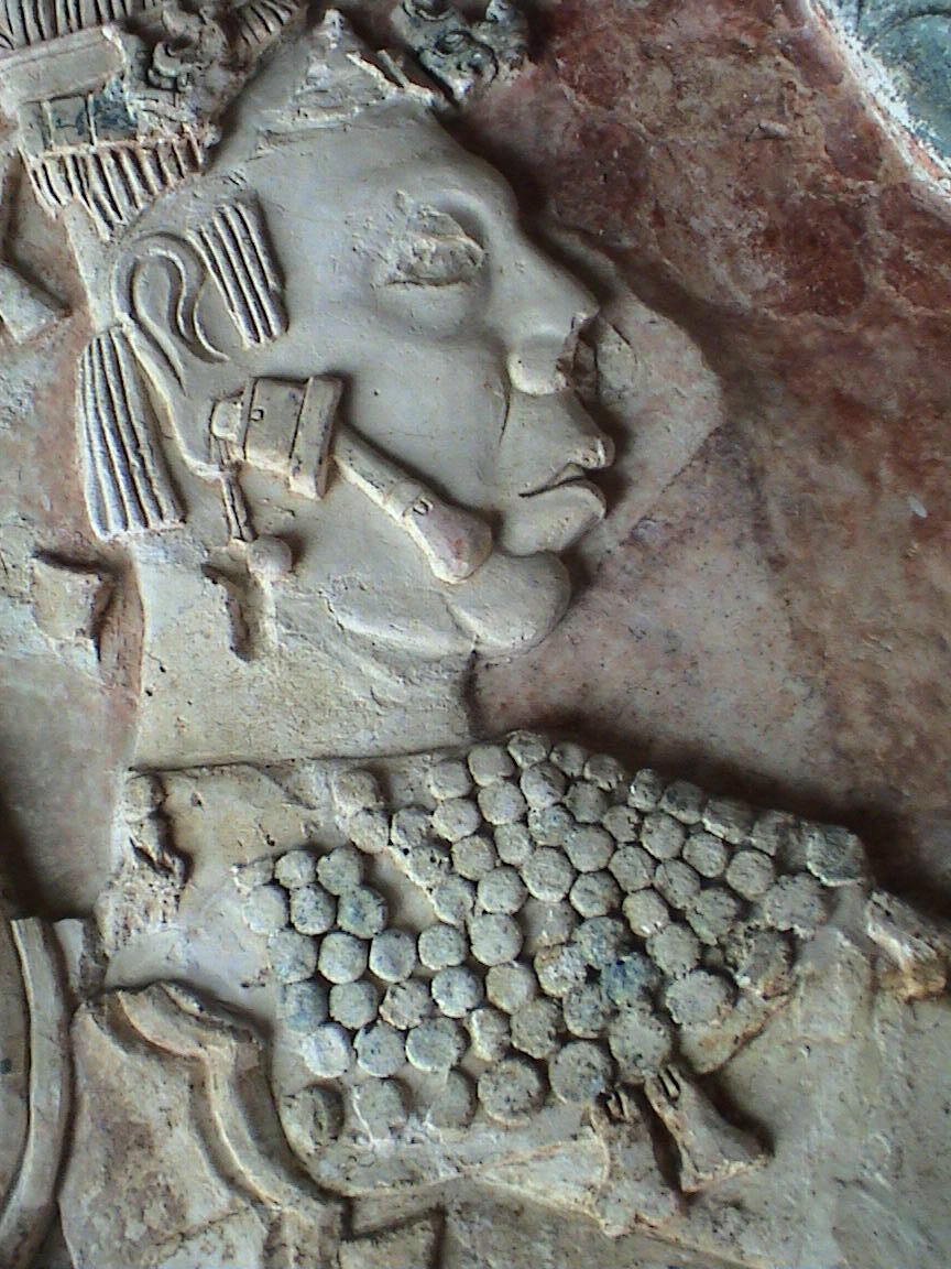
Relief Sculpture from Pelenque Ruins
Greatly influenced by his Mexican and Zapotec heritage, much of Rufino Tamayo’s artwork, particularly Tamayo’s Mixografia prints, illustrate the same weight and feel of Pre-Columbian stone reliefs and sculptures. Rufino Tamayo became interested in Pre-Columbian art as early as 1926, when Tamayo became the head of the department of ethnographic drawing at the National Museum of Archaeology in Mexico City.


Nocturno, 1975 ETCHING
Most of the compositions in Rufino Tamayo’s original graphics are extremely simple yet highly inventive in their technicality. Tamayo was known for taking an elementary drawing and filling it with structural elements, textures and colors obtaining striking etchings, lithographs and mixographs created with eloquent and economical expression.

Hombre, 1979 LITHOGRAPH
Rufino Tamayo was one of the first artists in Latin America to interpret his roots without historicism, anecdote, or proclamation. In doing so, Rufino Tamayo formed one of the most brilliant chapters of the already rich and prestigious field of original graphic art in Mexico.


To view the gallery’s collection of available Rufino Tamayo
Prints please visit our website:


Saturday, February 5, 2011

Marc Chagall - The Story of Exodus


Exodus - "God parted the clouds... "(M467)


Marc Chagall and Lithography

Marc Chagall was introduced to original lithography by Fernand Mourlot, owner of the renowned Mourlot Atelier lithographic studio located in Paris, France. Marc Chagall worked closely with Master Printer Charles Sorlier and over the next 35 years, Chagall created over 1,000 original lithographs at the Atelier Mourlot. The partnership between Marc Chagall and Charles Sorlier was extremely fruitful. . Charles Sorlier advised Chagall on all his future color lithograph projects and supervised their printing at the Mourlot Studio:
  

Marc Chagall
"Marc Chagall fabricated a mystical world of lovers, musicians and artists in his work. Chagall chose lithography as a print medium that could offer him almost unlimited painterly freedom to explore this world. Since lithography is a technique where the artist can work directly on the printing plate or lithostone, the resultant prints convey the spontaneity of Chagall’s brushstrokes and drawn lines. Lithography also allowed Chagall to work in lush color, which he viewed as his métier, and for which Chagall has become renowned. Chagall's lithographs are now among the most collected art works of the 20th century."
                                                                  – Charles Sorlier

While working with Charles Sorlier and Mourlot, Chagall completed many lithographic series including The Bible, The Story of Exodus, The Circus, Daphnis and Chloe and The Odyssey. Chagall used up to 25 different lithographic plates per print to achieve the perfect expression of color. Over the course of his lifetime, Marc Chagall continued to be fascinated with color lithography as a printmaking medium and retained the Mourlot Atelier and especially Charles Sorlier as his creative collaborators.

Marc Chagall and The Bible

   
Exodus "Moses and
the Burning Bush" (M447)
Raised in a remote village in present day Belarus, Marc Chagall’s Jewish heritage proved to be one of the major influences in Marc Chagall’s Art. Chagall’s art is characterized by imagery drawn from the quaint Jewish village including animals from Chagall’s childhood, his strong family heritage, and the Jewish faith and practice. Chagall endeavored to express the spiritual meaning and moral messages found in Biblical teachings through his paintings, lithography, etchings, and original prints.


Exodus - "Bezaleel and
his Golden Cherubim" (M464)
“Ever since my earliest youth I have been fascinated by the Bible. The Bible is the echo of nature, and this I have endeavored to transmit. . . . In art everything is possible, so long as it is based on love.” – Marc Chagall

In 1966, Marc Chagall created a series of original lithographs depicting the biblical Story of the Exodus. The Story of Exodus portfolio contained 24 large color lithographs. 23 of The Story of Exodus Lithographs were printed on paper measuring 50 x 37 cm and the last original print was created as a double-size plate with a centerfold. The Story of Exodus was created in a limited edition consisting of 285 portfolios signed on the justification page by Marc Chagall: 250 on Velin d'Arches numbered from 1 to 250; 20 on Japon Nacre paper; and 15 hors commerce (not for sale) lettered A to O reserved for project collaborators.

 
Exodus - "Moses Calls Down the
Waters Upon the Eqyptians" (M453)
 The name Exodus means "going out" or “departure". It refers not only to one of the most important events of the book Exodus (the Exodus of the Israelites from Egypt), but also to other highly significant events as well, such as the call of Moses and God’s covenant with the nation Israel at Sinai - an experience culminating in God’s giving of the moral law (Ten Commandments) through Moses to the people. Portraying one of the most important stories of The Old Testament, and one of the central figures in the Jewish faith, Chagall’s Story of Exodus is a brilliant series with vivid color illuminating the spiritual and emotional nature of the story.


Exodus - "Moses Shows the
Elders the Tablets of the Law" (M457)
Often Marc Chagall would travel to foreign countries for inspiration for his artwork. Prior to creating The Story of Exodus, Chagall made a personal and spiritual journey to Palestine and present day Israel. Chagall wanted to experience the land and culture of the birthplace of Judaism. Chagall’s time spent in the Middle East influenced all of his biblically themed works, including the Exodus Series as well as the Bible Series.
  
Exodus - "Then
Came Alamek" (M456)

“I saw the hills of Sodom and the Negev, out of whose defiles appear the shadows of our prophets in their yellowish garments, the color of dry bread. I heard their ancient words. . . . Have they not truly and justly shown in their words how to behave on this earth and by what ideal to live?” – Marc Chagall

Marc Chagall’s illustrations of The Story of Exodus are magnificent examples of Chagall’s masterful use of vibrant color to create lush depth, texture and emotion. The Exodus lithographs were highly acclaimed at their time of release and remain one of Chagall’s most popular series due to their expert use of color and fervent imagery.

 
Exodus - "Moses Sees the
Suffering of his People" (M446)
“Changes in societal structure and in art would possess more credibility if they had their origins in the soul and spirit. If people read the words of the prophets with closer attention, they would find the keys to life.”
  - Marc Chagall


To view our collection of available Marc Chagall Prints
please visit our website:


Thursday, January 6, 2011

Tom Wesselmann - The Great American Nude

Monica with Motherwell, 1994 Serigraph
 "Personality would only be distraction from the simple fact of nudity. When I create physical details like lips or nipples, they are of importance for the erotic simplification. From the beginning I never gave them faces. A face gives personal touch to a sexual act, makes it a portrait act. And that, I don´t like at all."
                                                             – Tom Wesselmann

Tom Wesselmann, an American born painter, sculptor, and printmaker, was born in Cincinnati, Ohio in 1931. Tom Wesselmann studied psychology at the University of Cincinnati and also took art classes at the Art Academy of Cincinnati. Wesselmann had originally intended to become a cartoonist, but instead turned to painting.
 
Claire sitting Robe Half Off (Portfolio 90), 1993 Screenprint
 From 1956-1959 Tom Wesselmann continued his art studies at the Cooper Union in New York. While studying in New York, Wesselmann quickly informed himself about modern art by visiting the museums where the art of Robert Motherwell and Willem de Kooning made a lasting impact on Wesselmann. In 1957 Tom Wesselmann met Claire Selley, another Cooper Union student who was to become his friend, model, and later, his wife. After graduating, Tom Wesselmann became one of the founding members of the Judson Gallery, along with Marc Ratliff and artist Jim Dine.

In 1961 Tom Wesselmann began working on his series the Great American Nude. After a dream concerning the phrase "red, white, and blue", Tom Wesselmann decided to paint a Great American Nude in a palette limited to those colors and any colors associated with patriotic motifs such as gold and khaki. Tom Wesselmann’s Great American Nude series incorporated representational images with an accordingly patriotic theme, such as American landscape photos and portraits of founding fathers. Often these nudes were collaged from magazines and discarded posters, and were very large scale. Tom Wesselmann had his first solo art show at the Tanager Gallery in New York later that year, representing both the large and small Great American Nude collages.

Tom Wesselmann would soon emerge as one of the leading figures in American Pop Art along with fellow artists Roy Lichtenstein, Andy Warhol, Jim Dine and Alex Katz among others. Tom Wesselmann never liked his inclusion in American Pop Art, pointing out how he made an aesthetic use of everyday objects and not a reference to them as consumer objects.

Still Life with Petunias, Lilies and Fruit, 1988 Screenprint
In 1962, Tom Wesselmann participated in the New Realists art exhibition, which included art by the American Pop artists Jim Dine, Robert Indiana, Roy Lichtenstein, and Andy Warhol; and Europeans such as Arman and Christo. Wesselmann contributed two Still Life collages to the art exhibition. That year, Wesselmann had begun working on a new series of Still Lifes, experimenting with assemblage as well as collage.

Still Life with Liz (Portfolio 90), 1993 Screenprint
Tom Wesselmann's subjects are characteristically overtly sexual and Wesselmann is best known for his artworks where the nude becomes a depersonalized sex symbol set in a commonplace environment. Wesselmann would emphasize the woman's nipples, mouth and genitals with the rest of the body depicted in flat, unmodulated color.
Bedroom Blonde, 1997 Serigraph
During the late 1960s and early 1970s Tom Wesselmann worked constantly on the 'Bedroom Painting Series' in which elements of his 'Great American Nude', 'Still Lifes' and 'Seascapes' were juxtaposed. With these artworks Wesselmann began to concentrate on a few details such as hands, feet and breasts surrounded by flowers and objects. A major motivation of the 'Bedroom Paintings' was to shift the focus and scale of the attendant objects around a nude; these objects are relatively small in relation to the nude, but become major, even dominant elements when the central element is a body part.

Nude with Bouquet and Stockings, 1992 Screenprint
Tom Wesselmann was a highly inventive printmaker who favored the screenprint or serigraph, but also worked in unconventional formats, such as blind embossing and mixograph relief prints. These large scale prints mirror the boldness of Wesselmann’s unique paintings and embody the vitality, openness and free spirit of the sixties.

Following surgery for Wesselmann’s heart condition, Tom Wesselmann died on December 17, 2004.

Select Museum Collections:
Museum of Modern Art, New York
Art Institute of Chicago, Chicago
Tate Gallery, London
Haifa Museum, Israel
Smithsonian Institution, Washington DC
National Gallery of Art, Washington DC
Norton Simon Museum, Pasadena
Walker Art Center, Minneapolis

Tuesday, November 23, 2010

Le Repas Frugal (The Frugal Meal) by Pablo Picasso

Le Repas Frugal, 1904
Etching
Image: 46.3 x 37.7 cm

Poised between Pablo Picasso’s two most significant periods, Le Repas Frugal (The Frugal Meal) by Pablo Picasso represents a pivotal point in the Pablo Picasso’s printmaking oeuvre. As part of Picasso’s first suite/series of etchings, entitled La Suite des Saltimbanques, Le Repas Frugal contains elements of both Picasso’s Blue Period, marked by its melancholic introspection, and Picasso’s Rose Period, characterized by Pablo Picasso’s fascination with strolling acrobats or players. The bohemian life of those who lived on the edge of society was important to the young struggling Picasso as he too frequented the circus, the theater and music halls to escape from his impoverished lifestyle.


Les Pauvres (Saltimbanques Suite), 1905
Etching
23.6 x 18 cm
The Frugal Meal portrays an iconic image of a starving couple with a meager spread. The nearly skeletal man looks to the side as he comforts his female companion, perhaps denying their dire circumstance and blind with the hope of a better tomorrow. The woman stares with tired but tearless eyes, engaging an empathy that can only be acquired by a human diligently struggling to maintain dignity in the face of destitution. Other etchings from the Saltimbanques Suite also portray these scenes of insolvent social outsiders.


The Frugal Meal
displayed at the MOMA, April 2010
Executed in only two states, The Frugal Meal etching possesses a remarkable confidence and skill that belies Picasso's lack of formal training in printmaking. Having just learnt the etching technique from Ricardo Canals, a fellow resident of Montmartre, it is astonishing that Pablo Picasso produced this icon in the history of printmaking at the age of only twenty-three. Le Repas Frugal is considered one of Pablo Picasso’s masterpieces as a printmaker and was only Picasso’s second work created in the medium. The medium of etching would fascinate Pablo Picasso for the remainder of his life.

First printed in small numbers by the printer Eugene Delatre in 1905, The Saltimbanques etching plates were later acquired by art dealer and publisher Ambroise Vollard. Vollard had the fragile copper plates steel-faced and, in 1913, the edition of 250 was printed by Louis Fort. Together with an additional eleven drypoints and two etchings made by Picasso between 1904 and 1906, these early prints are commonly known as the Saltimbanques Suite.

Le Repas Frugal was recently exhibited at the Pablo Picasso Prints and Paintings exhibition at The Museum of Modern Art, New York. The Frugal Meal is a part of the permanent collections of the following museums and institutions:

The Metropolitan Museum of Art, New York
The Musee Picasso, Paris
The Museo Picasso, Barcelona


Saturday, October 30, 2010

Georges Braque Biography

“Once an object has been incorporated in a picture it accepts a new destiny.” – Georges Braque

Oiseau Blanc, 1961 , Ceramic Plaque
Artist Georges Braque was born on May 13, 1882, in Argenteuil sur Seine, France. The son of a house decorator, Georges Braque received his first art lessons in painting from his father. In 1890 the Braque family moved to Le Havre, where Georges Braque would attend evening art classes at the Ecole des Beaux-Arts from about 1897 to 1899. At the age of 19, Georges Braque left for Paris to get a craftsman certificate.

From 1902 to 1904, Georges Braque studied art at the Academie Humbert in Paris, where Braque met artists Marie Laurencin and Francis Picabia. By 1906, Georges Braque had evolved his art from the Impressionist style into the bolder Fauvist style. Georges Braque showed Fauvist works of art the following year in the Salon des Independants in Paris. Georges Braque had his first solo art show at Daniel-Henri Kahnweiler’s gallery in 1908.

In 1909, Georges Braque began to work very closely with artist and collegue Pablo Picasso, as the two artists’ styles were becoming very similar. Both Braque and Picasso’s art showed an increased interest in geometry and simultaneous perspective, and by 1911 Georges Braque and Pablo Picasso had developed the artistic style of Cubism. One of Picasso's many pet names for Georges Braque was 'Vilbour' or 'Wilbourg', a reference to Wilbur Wright. Pablo Picasso saw in their 1908-1914 creative art partnership something that was akin to the brothers Wilbur and Orville Wright, the pioneers of sustained powered flight. In 1912, Georges Braque and Pablo Picasso started to incorporate collage elements into their art and to experiment with the papier colle (pasted paper) technique, in which Barque utilized a roll of wallpaper found in a local shop. Braque and Picasso’s productive collaboration continued until the outbreak of World War I in 1914.

Georges Braque served with honor in the French army during World War I and was seriously wounded in the head, leaving Braque temporarily blinded and unable to create art. Upon recovering in 1917, Georges Braque began a close friendship with cubist artist Juan Gris.

Theiere et Fruits, c. 1950 , Collotype


After the war Georges Braque became freer and less schematic in his art, moving away from the harsher abstraction of Cubism. Braque painted many still life subjects during this time, maintaining an emphasis on structure. In 1922 Georges Braque had an art exhibition at the Salon d’Automne in Paris that brought Braque great fame and recognition. During the mid-1920s, Georges Braque designed the art decor for two Sergei Diaghilev ballets. By the end of the decade, Georges Braque had returned to a more realistic interpretation of nature, although certain aspects of Cubism always remained present in Braque’s art.

 In 1931, Georges Braque created his first engraved plasters and began to portray mythological subjects. Georges Braque had his first important art retrospective in 1933 at the Kunsthalle Basel. In 1937 Braque won First Prize at the Carnegie International, in Pittsburgh.


Georges Braque at his studio with Mourlot and Master Printers, 1962

During World War II, Georges Braque remained in Paris. During this period Braque primarily painted still-lifes and interiors, and Braque’s art became more and more somber as the war continued. From the late 1940s Georges Braque created numerous lithographs, engravings, and sculptures where, Braque utilized recurring themes of birds, ateliers, landscapes, and seascapes. Georges Braque, along with Henri Matisse, is credited for introducing Pablo Picasso to Fernand Mourlot, and most of the lithographs, illustrated books, and original prints Braque created in the 1940s and '50s were produced at the Mourlot Lithography Studios. In 1948 Georges Braque was awarded the main prize for painting at the Venice Biennale, and in 1951 Braque was made a Commander of the Legion of Honour. A few years later, Braque employed his skills as a craftsman, when Braque designed stained-glass windows for the church of Varengeville and painted the ceiling for the Etruscan Gallery at The Louvre. In 1961 George Braque had the distinction of being the first living artist to have his art exhibited at The Louvre.


Louvre I , c. 1955, Lithograph


Louvre IV, c. 1955, Lithograph

During the last few years of Braque’s life, ill health prevented Braque from undertaking further large-scale commissions, but Baroque continued to paint, create lithographs, and design jewelry. Georges Braque died on August 31, 1963, in Paris with his wife, Marcelle, at his side.